Quantitative Analysis in R

Session 1 · Descriptive Statistics & Exploring Data

SARA Institute of Data Science

2026-07-25

Welcome

  • Three sessions, ~90 minutes each, building on one another:
    1. Descriptive Statistics — what does the data look like?
    2. Hypothesis Testing — is a difference/relationship real?
    3. Regression & Reporting — how much, and how do I report it?
  • We assume you’ve already worked with R/RStudio and ggplot2
  • All three sessions use the same dataset: palmerpenguins

Session 1 roadmap

Time Topic
0–15 min Data structures for analysis
15–35 min Central tendency & spread
35–55 min Grouped summaries
55–75 min Visual exploration
75–90 min Your Turn + wrap-up

Data Structures for Analysis

The dataset: palmerpenguins

glimpse(penguins)
Rows: 344
Columns: 8
$ species           <fct> Adelie, Adelie, Adelie, Adelie, Adelie, Adelie, Adel…
$ island            <fct> Torgersen, Torgersen, Torgersen, Torgersen, Torgerse…
$ bill_length_mm    <dbl> 39.1, 39.5, 40.3, NA, 36.7, 39.3, 38.9, 39.2, 34.1, …
$ bill_depth_mm     <dbl> 18.7, 17.4, 18.0, NA, 19.3, 20.6, 17.8, 19.6, 18.1, …
$ flipper_length_mm <int> 181, 186, 195, NA, 193, 190, 181, 195, 193, 190, 186…
$ body_mass_g       <int> 3750, 3800, 3250, NA, 3450, 3650, 3625, 4675, 3475, …
$ sex               <fct> male, female, female, NA, female, male, female, male…
$ year              <int> 2007, 2007, 2007, 2007, 2007, 2007, 2007, 2007, 2007…
  • Numeric (continuous): bill_length_mm, bill_depth_mm, flipper_length_mm, body_mass_g
  • Categorical (factor/character): species, island, sex
  • 344 rows, some missing values (NA) — very typical of real research data

Why the numeric/categorical distinction matters

Variable type What we compute Example
Numeric mean, SD, correlation body_mass_g
Categorical counts, proportions species
Numeric × Categorical grouped summaries, t-test, ANOVA body_mass_g by species
Categorical × Categorical cross-tabs, chi-square species by island

This table is essentially a map for the rest of the three sessions — every statistical technique we cover exists because of which combination of variable types you’re working with.

Checking missingness first

colSums(is.na(penguins))
          species            island    bill_length_mm     bill_depth_mm 
                0                 0                 2                 2 
flipper_length_mm       body_mass_g               sex              year 
                2                 2                11                 0 

Always check this before running any statistic. Two penguins are missing sex; the same two are missing all four measurements — worth investigating why, not just ignoring.

Central Tendency & Spread

Measures of central tendency

mean(penguins$body_mass_g, na.rm = TRUE)
[1] 4201.754
median(penguins$body_mass_g, na.rm = TRUE)
[1] 4050
  • na.rm = TRUE is essential here — without it, mean() returns NA if even one value is missing
  • Mean vs. median: mean is pulled by outliers/skew; median is more robust. Always check both, especially with real-world (messy) data

Measures of spread

sd(penguins$body_mass_g, na.rm = TRUE)
[1] 801.9545
var(penguins$body_mass_g, na.rm = TRUE)
[1] 643131.1
IQR(penguins$body_mass_g, na.rm = TRUE)
[1] 1200
quantile(penguins$body_mass_g, na.rm = TRUE)
  0%  25%  50%  75% 100% 
2700 3550 4050 4750 6300 
  • SD: average distance from the mean, same units as the variable
  • Variance: SD squared — used more in formulas than in reporting
  • IQR: range of the middle 50% — robust to outliers, pairs naturally with the median

The five-number summary

summary(penguins$body_mass_g)
   Min. 1st Qu.  Median    Mean 3rd Qu.    Max.     NAs 
   2700    3550    4050    4202    4750    6300       2 

summary() gives you min, Q1, median, mean, Q3, max, and missing count all at once — often your very first line of code on any new numeric variable.

Your Turn 1 (8 min)

For flipper_length_mm:

  1. Compute the mean and median. Are they close together?
  2. Compute the SD and IQR.
  3. Run summary() on it.

Answer

mean(penguins$flipper_length_mm, na.rm = TRUE)
[1] 200.9152
median(penguins$flipper_length_mm, na.rm = TRUE)
[1] 197
sd(penguins$flipper_length_mm, na.rm = TRUE)
[1] 14.06171
IQR(penguins$flipper_length_mm, na.rm = TRUE)
[1] 23
summary(penguins$flipper_length_mm)
   Min. 1st Qu.  Median    Mean 3rd Qu.    Max.     NAs 
  172.0   190.0   197.0   200.9   213.0   231.0       2 

Mean and median are close (~200mm) — a sign the distribution isn’t heavily skewed.

Grouped Summaries

group_by() + summarise()

penguins |>
  group_by(species) |>
  summarise(
    mean_mass = mean(body_mass_g, na.rm = TRUE),
    sd_mass   = sd(body_mass_g, na.rm = TRUE),
    n         = n()
  )
# A tibble: 3 × 4
  species   mean_mass sd_mass     n
  <fct>         <dbl>   <dbl> <int>
1 Adelie        3701.    459.   152
2 Chinstrap     3733.    384.    68
3 Gentoo        5076.    504.   124

This is the single most-used pattern in applied quantitative work: “give me this statistic, for each level of this category.” Everything from Session 2 onward builds on being able to read this table.

Grouping by more than one variable

penguins |>
  group_by(species, sex) |>
  summarise(mean_mass = mean(body_mass_g, na.rm = TRUE), .groups = "drop")
# A tibble: 8 × 3
  species   sex    mean_mass
  <fct>     <fct>      <dbl>
1 Adelie    female     3369.
2 Adelie    male       4043.
3 Adelie    <NA>       3540 
4 Chinstrap female     3527.
5 Chinstrap male       3939.
6 Gentoo    female     4680.
7 Gentoo    male       5485.
8 Gentoo    <NA>       4588.

.groups = "drop" avoids a message and returns a plain (ungrouped) tibble — good habit once you start chaining more steps after summarise().

Standard error — a bridge to Session 2

penguins |>
  filter(!is.na(body_mass_g)) |>
  group_by(species) |>
  summarise(
    mean_mass = mean(body_mass_g),
    se_mass   = sd(body_mass_g) / sqrt(n())
  )
# A tibble: 3 × 3
  species   mean_mass se_mass
  <fct>         <dbl>   <dbl>
1 Adelie        3701.    37.3
2 Chinstrap     3733.    46.6
3 Gentoo        5076.    45.5

SD describes spread of individual penguins. Standard error (SE) describes uncertainty in the mean itself — how much would this mean likely shift if we resampled? SE is the foundation of confidence intervals and t-tests, both coming in Session 2.

Your Turn 2 (10 min)

  1. Group penguins by island and compute mean and SE of bill_length_mm
  2. Which island has the largest average bill length? Which has the most uncertainty (largest SE)?

Answer

penguins |>
  filter(!is.na(bill_length_mm)) |>
  group_by(island) |>
  summarise(
    mean_bill = mean(bill_length_mm),
    se_bill   = sd(bill_length_mm) / sqrt(n())
  )
# A tibble: 3 × 3
  island    mean_bill se_bill
  <fct>         <dbl>   <dbl>
1 Biscoe         45.3   0.369
2 Dream          44.2   0.535
3 Torgersen      39.0   0.424

Visual Exploration

Why visualise before testing

  • Numbers alone can hide skew, outliers, or multi-modal distributions
  • A quick plot often prevents a wrong statistical choice later (e.g. running a t-test on badly skewed data)

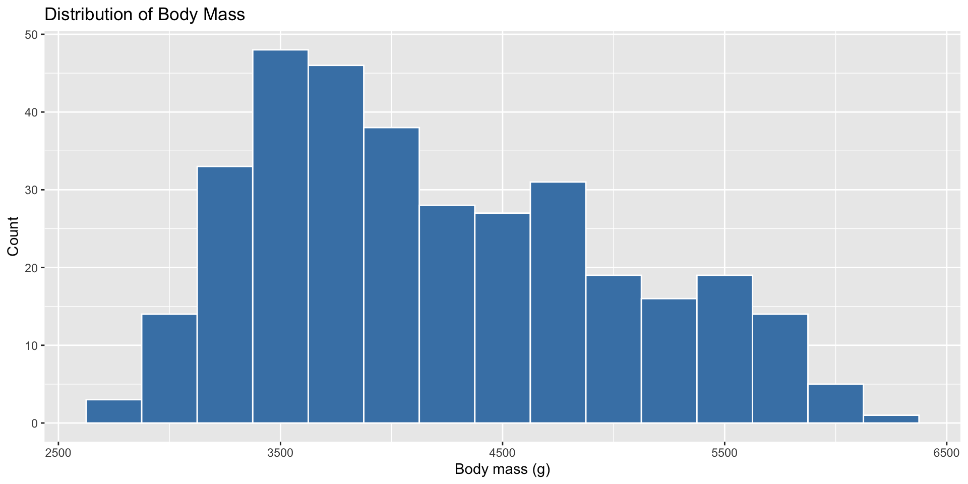
Histogram — shape of one variable

ggplot(penguins, aes(x = body_mass_g)) +
  geom_histogram(binwidth = 250, fill = "steelblue", color = "white") +
  labs(title = "Distribution of Body Mass", x = "Body mass (g)", y = "Count")

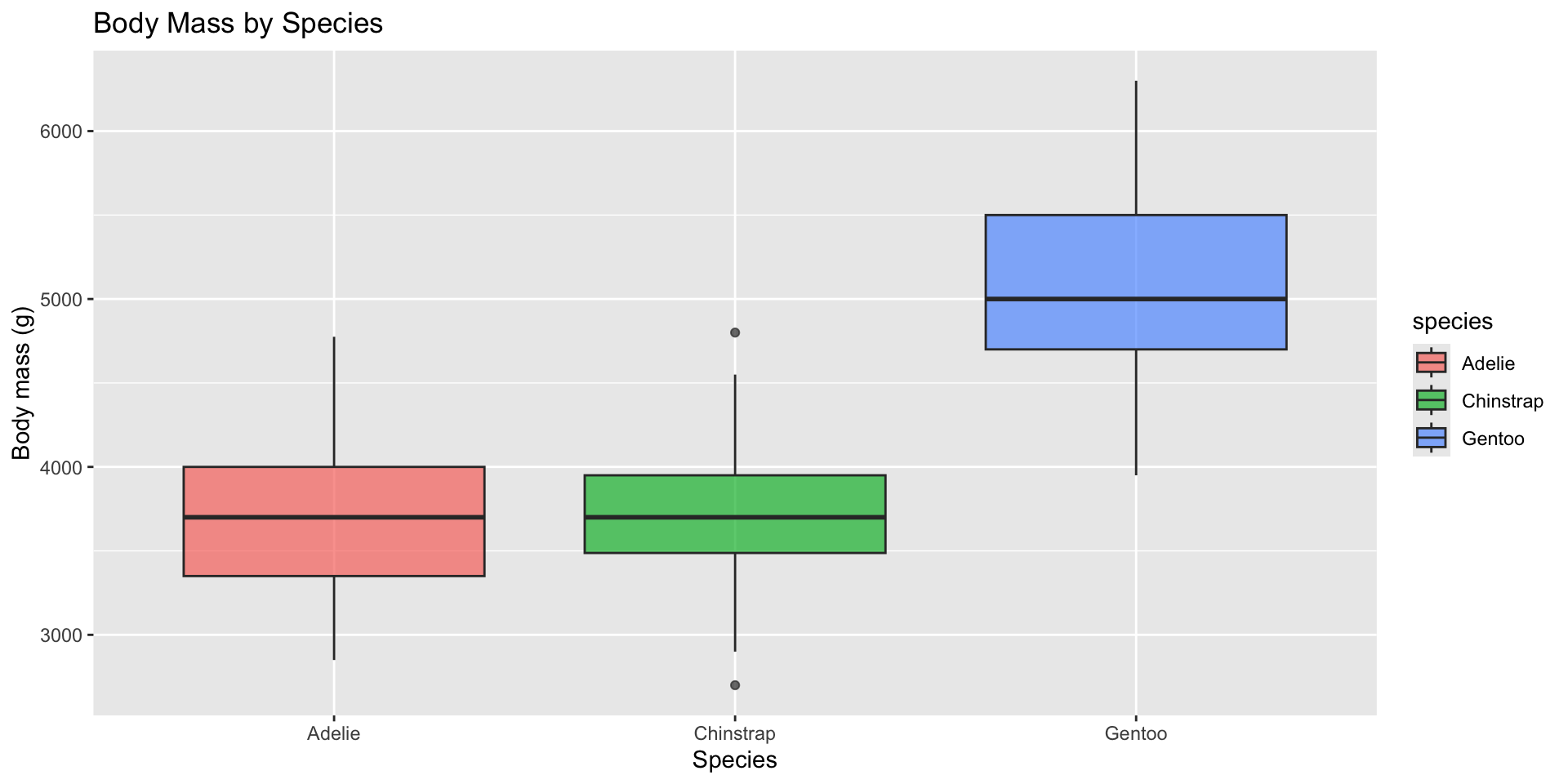
Boxplot — spread across groups

ggplot(penguins, aes(x = species, y = body_mass_g, fill = species)) +
  geom_boxplot(alpha = 0.7) +
  labs(title = "Body Mass by Species", x = "Species", y = "Body mass (g)")

A boxplot is a visual version of the five-number summary — box = IQR, line = median, whiskers ≈ range, dots = potential outliers. This is exactly what we’ll be testing formally in Session 2 (ANOVA).

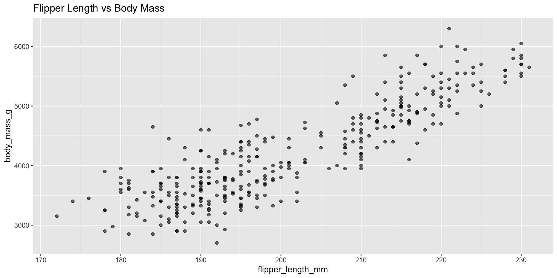
Scatterplot & correlation (descriptive, not yet a test)

ggplot(penguins, aes(x = flipper_length_mm, y = body_mass_g)) +
  geom_point(alpha = 0.6) +
  labs(title = "Flipper Length vs Body Mass")
cor(penguins$flipper_length_mm, penguins$body_mass_g, use = "complete.obs")
[1] 0.8712018

cor() gives a single number (-1 to 1) summarising the strength and direction of a linear relationship. Right now this is purely descriptive — in Session 2, cor.test() will tell us whether this correlation is statistically distinguishable from zero.

Your Turn 3 (10 min)

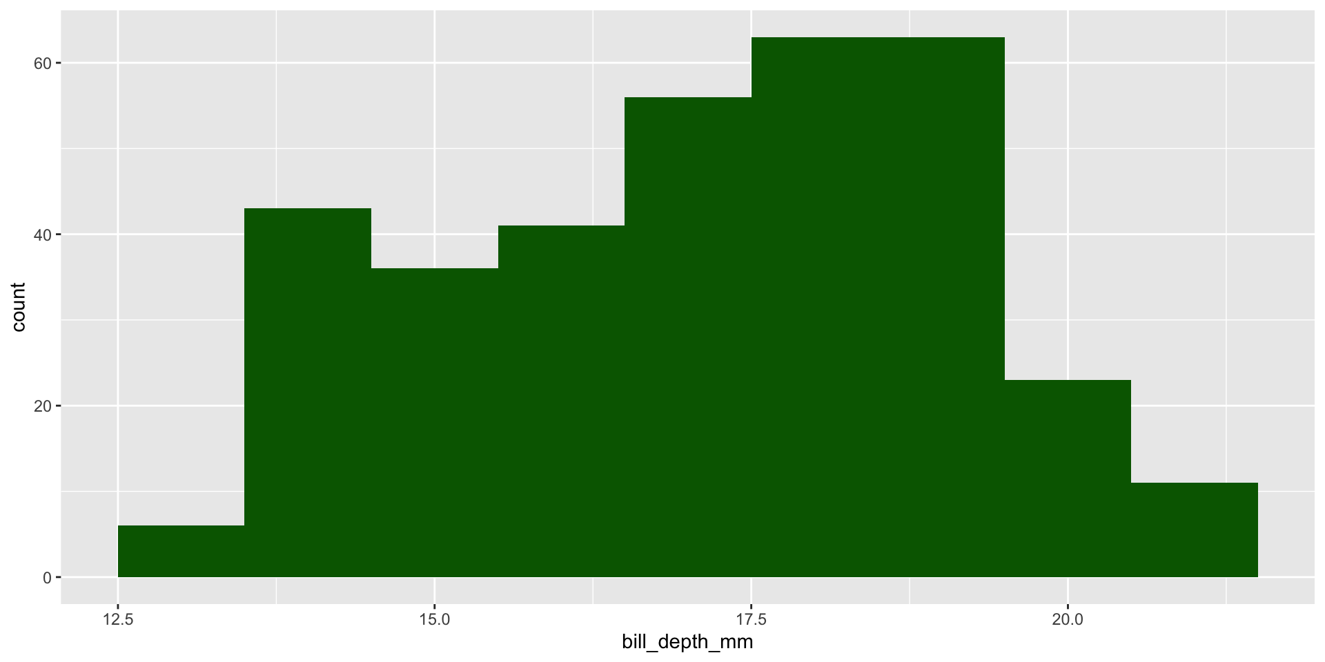
  1. Make a histogram of bill_depth_mm
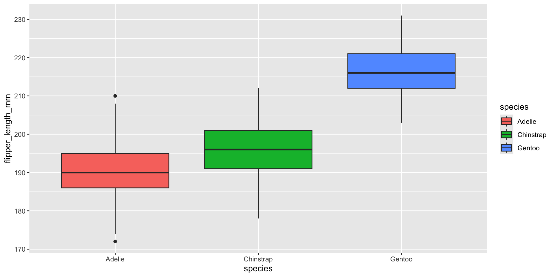
  2. Make a boxplot of flipper_length_mm by species
  3. Compute the correlation between bill_length_mm and bill_depth_mm

Answer

ggplot(penguins, aes(x = bill_depth_mm)) +
  geom_histogram(binwidth = 1, fill = "darkgreen")

ggplot(penguins, aes(x = species, y = flipper_length_mm, fill = species)) +
  geom_boxplot()

cor(penguins$bill_length_mm, penguins$bill_depth_mm, use = "complete.obs")
[1] -0.2350529

Note the correlation is slightly negative overall — but recall from the viz workshop that this reverses within each species (Simpson’s Paradox). Descriptive stats always deserve a visual sanity check.

Recap — Session 1

  • Know your variable types before choosing any statistic: numeric vs. categorical
  • Mean/median describe the centre; SD/IQR describe the spread; always check both
  • group_by() + summarise() is the core pattern for comparing groups
  • Standard error ≠ standard deviation — SE describes uncertainty in the mean
  • Always visualise (histogram, boxplot, scatterplot) before testing

Before Session 2

Practice at home:

# 1. Compute mean, SD, and SE of body_mass_g for each sex
# 2. Make a boxplot of body_mass_g by sex
# 3. Looking at the boxplot, do you think male and female penguins
#    differ in body mass? We'll test this formally next session.

Next session: turning “does this look different” into a formal statistical test — t-tests, ANOVA, correlation tests, and chi-square.

Thank you!

Session 1 complete

SARA Institute of Data Science