Data Visualisation with R

Session 1 · Getting Started — R, RStudio & Your First Plot

SARA Institute of Data Science

2026-07-21

Welcome!

  • This is a hands-on workshop. Please have RStudio open in front of you.
  • No prior coding experience is assumed. We start from zero.
  • Three sessions, ~90 minutes each:
    1. Getting Started — R, RStudio, your first plot
    2. Grammar of Graphics — aesthetics, geoms, facets
    3. Polishing & Publishing — labels, themes, saving your work
  • Today’s motto: you will make a real plot in the first 30 minutes.

Why data visualisation?

  • A good chart answers a question faster than a table of numbers ever could
  • As researchers, we visualise to:
    • explore data and spot patterns/errors
    • explain findings to others (papers, viva, funders, community)
  • R + ggplot2 is one of the most widely used tools for this in research, government, and industry worldwide

Goal for today: understand why a plot looks the way it does, not just copy-paste code.

Session 1 roadmap

Time Topic
0–10 min What is R? What is RStudio?
10–25 min Panes tour + first R commands
25–40 min Packages, loading data, exploring penguins
40–55 min The Grammar of Graphics + first scatter plot
55–75 min Aesthetics: colour, and bar charts
75–90 min Your Turn practice + wrap-up

What is R? What is RStudio?

R vs RStudio — an analogy

R

  • The engine — the actual programming language
  • Free and open-source
  • Does all the actual computing

RStudio

  • The car built around the engine
  • A friendly interface (IDE) to write and run R code
  • Also free and open-source

You always need R installed first, then RStudio on top of it. You will never open “R” directly — you always work through RStudio.

A tour of RStudio

When you open RStudio you will usually see four panes:

  1. Source (top-left) — where you write and save your code (a script, .R or .qmd file)
  2. Console (bottom-left) — where code actually runs, one line at a time
  3. Environment / History (top-right) — shows objects you’ve created (data, variables)
  4. Files / Plots / Packages / Help (bottom-right) — file browser, and this is where your plots will appear!

Golden rule: always write your code in the Script, not directly in the Console. The script is saved; the console is not.

Your very first R commands

Type these into the Console and press Enter after each line:

2 + 2
[1] 4
"Hello, SARA!"
[1] "Hello, SARA!"
10 / 3
[1] 3.333333

R is a calculator, a text-handler, and — very soon — a plotting machine, all at once.

Creating objects with <-

In R, we store things using the assignment arrow <- (shortcut: Alt + -)

my_age <- 25
my_age
[1] 25
workshop_name <- "R for Researchers"
workshop_name
[1] "R for Researchers"

Think of <- as “put this value into this box, and name the box.” You can reuse the box (object) any time by typing its name.

A note on scripts vs .qmd files

  • A plain R script (.R) runs code top to bottom
  • A Quarto document (.qmd) — like the one this workshop is built in! — mixes writing and code together, and can produce slides, reports, PDFs, or websites
  • Code lives inside “chunks”:
```{r}
2 + 2
```

For this workshop, a simple R Script (File → New File → R Script) is all you need. We’ll use .qmd later if time allows.

Packages, and Meeting Our Data

What is a “package”?

  • Base R can do a lot, but packages add extra tools written by the R community
  • Install a package once per computer:
install.packages("tidyverse")
install.packages("palmerpenguins")
  • Then load it every time you start a new R session:
library(tidyverse)
library(palmerpenguins)

install.packages() = buying the toolbox. library() = opening the toolbox on your desk today.

Meet the tidyverse

tidyverse is not one package — it’s a collection of packages that work well together, including:

  • ggplot2 — for data visualisation (our focus!)
  • dplyr — for filtering/summarising data
  • readr — for reading in data files (CSV etc.)

Loading tidyverse loads all of these together, so we only need one library() line.

Meet the data: palmerpenguins

  • A free, beginner-friendly dataset of 344 penguins from three species, collected near Palmer Station, Antarctica
  • Comes bundled inside the palmerpenguins package — no file to download!
  • Variables include:
Variable Meaning
species Adelie, Chinstrap, or Gentoo
island Biscoe, Dream, or Torgersen
bill_length_mm / bill_depth_mm beak size
flipper_length_mm flipper size
body_mass_g weight in grams
sex, year sex and year recorded

Loading and looking at the data

data(penguins)
head(penguins)
# A tibble: 6 × 8
  species island    bill_length_mm bill_depth_mm flipper_length_mm body_mass_g
  <fct>   <fct>              <dbl>         <dbl>             <int>       <int>
1 Adelie  Torgersen           39.1          18.7               181        3750
2 Adelie  Torgersen           39.5          17.4               186        3800
3 Adelie  Torgersen           40.3          18                 195        3250
4 Adelie  Torgersen           NA            NA                  NA          NA
5 Adelie  Torgersen           36.7          19.3               193        3450
6 Adelie  Torgersen           39.3          20.6               190        3650
# ℹ 2 more variables: sex <fct>, year <int>
glimpse(penguins)
Rows: 344
Columns: 8
$ species           <fct> Adelie, Adelie, Adelie, Adelie, Adelie, Adelie, Adel…
$ island            <fct> Torgersen, Torgersen, Torgersen, Torgersen, Torgerse…
$ bill_length_mm    <dbl> 39.1, 39.5, 40.3, NA, 36.7, 39.3, 38.9, 39.2, 34.1, …
$ bill_depth_mm     <dbl> 18.7, 17.4, 18.0, NA, 19.3, 20.6, 17.8, 19.6, 18.1, …
$ flipper_length_mm <int> 181, 186, 195, NA, 193, 190, 181, 195, 193, 190, 186…
$ body_mass_g       <int> 3750, 3800, 3250, NA, 3450, 3650, 3625, 4675, 3475, …
$ sex               <fct> male, female, female, NA, female, male, female, male…
$ year              <int> 2007, 2007, 2007, 2007, 2007, 2007, 2007, 2007, 2007…

Quick exploration commands

dim(penguins)      # rows, columns
[1] 344   8
summary(penguins$body_mass_g)   # quick stats on one column
   Min. 1st Qu.  Median    Mean 3rd Qu.    Max.     NAs 
   2700    3550    4050    4202    4750    6300       2 

Note the $ signpenguins$body_mass_g means “go into the penguins table and pull out the body_mass_g column.”

Your Turn 1 (5 min)

  1. Load the penguins data (if not already loaded)
  2. Use str() on penguins — how is it different from glimpse()?
  3. Find the summary of flipper_length_mm using summary()

Answer

str(penguins)
tibble [344 × 8] (S3: tbl_df/tbl/data.frame)
 $ species          : Factor w/ 3 levels "Adelie","Chinstrap",..: 1 1 1 1 1 1 1 1 1 1 ...
 $ island           : Factor w/ 3 levels "Biscoe","Dream",..: 3 3 3 3 3 3 3 3 3 3 ...
 $ bill_length_mm   : num [1:344] 39.1 39.5 40.3 NA 36.7 39.3 38.9 39.2 34.1 42 ...
 $ bill_depth_mm    : num [1:344] 18.7 17.4 18 NA 19.3 20.6 17.8 19.6 18.1 20.2 ...
 $ flipper_length_mm: int [1:344] 181 186 195 NA 193 190 181 195 193 190 ...
 $ body_mass_g      : int [1:344] 3750 3800 3250 NA 3450 3650 3625 4675 3475 4250 ...
 $ sex              : Factor w/ 2 levels "female","male": 2 1 1 NA 1 2 1 2 NA NA ...
 $ year             : int [1:344] 2007 2007 2007 2007 2007 2007 2007 2007 2007 2007 ...
summary(penguins$flipper_length_mm)
   Min. 1st Qu.  Median    Mean 3rd Qu.    Max.     NAs 
  172.0   190.0   197.0   200.9   213.0   231.0       2 

str() and glimpse() show similar info; glimpse() (from dplyr) is usually easier to read because it prints one variable per line.

The Grammar of Graphics

The big idea behind ggplot2

“gg” stands for Grammar of Graphics — every plot is built from the same simple layers:

  1. Data — which data frame?
  2. Aesthetics (aes) — which columns map to x, y, colour, size…?
  3. Geometry (geom) — what type of plot? points, bars, lines…
  4. (later: facets, themes, labels, scales)

Once you know this grammar, you can build almost any chart by combining the same small set of building blocks.

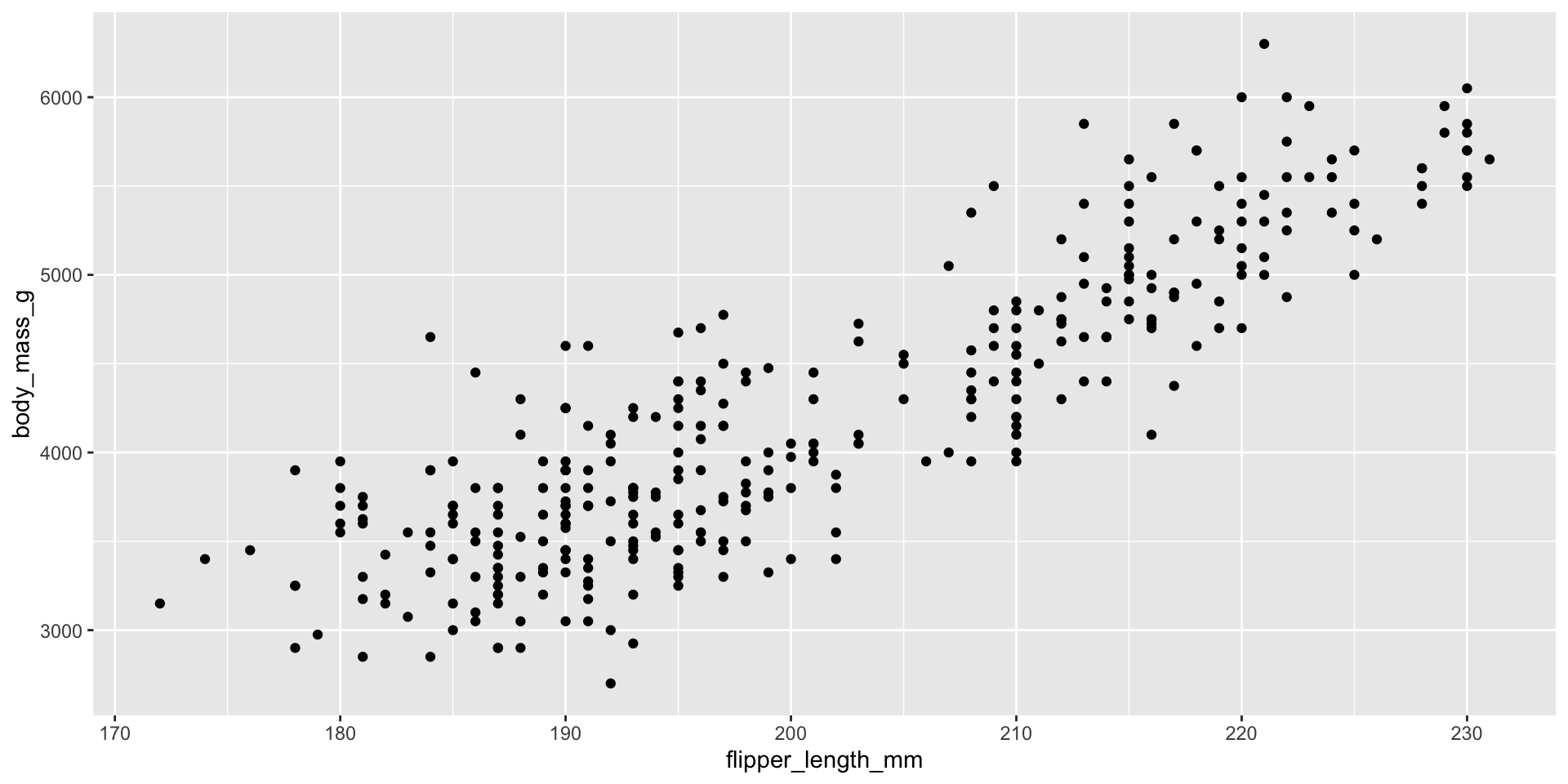
Your first plot — a scatter plot

ggplot(data = penguins, aes(x = flipper_length_mm, y = body_mass_g)) +
  geom_point()

Breaking that down, line by line

ggplot(data = penguins,                              # 1. which data?
       aes(x = flipper_length_mm, y = body_mass_g)) +# 2. what maps to x/y?
  geom_point()                                        # 3. draw it as points
  • ggplot() starts the plot and sets up the “canvas”
  • aes() = aesthetic mapping — connects data columns to visual properties
  • + adds a layer — geoms are always added with +, never a comma
  • geom_point() says: “draw one point per row of data”

Common beginner mistake: putting + at the start of a new line instead of the end of the previous line. R needs the + at the end to know more is coming!

Your Turn 2 (7 min)

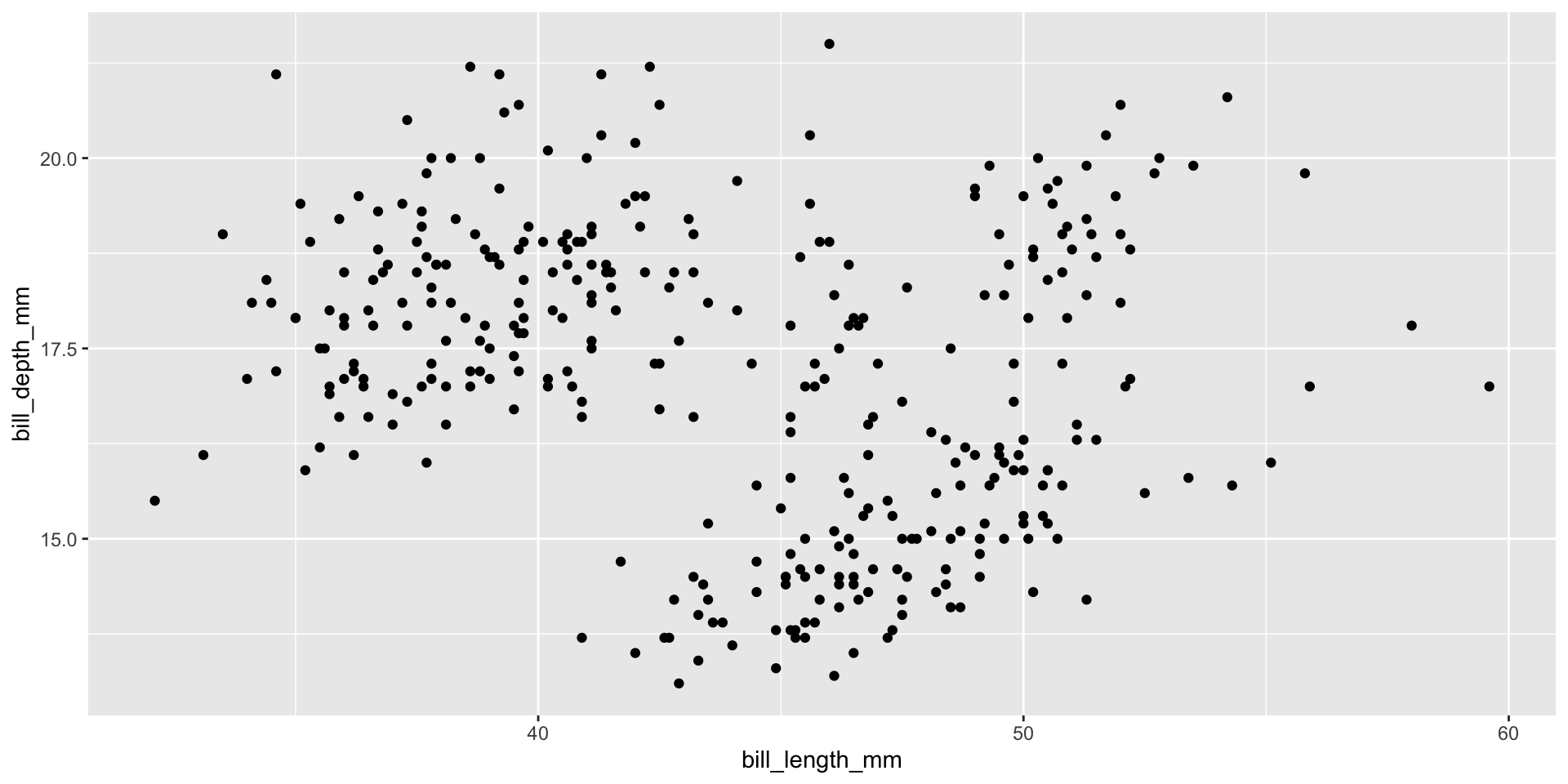
Make a scatter plot of bill_length_mm (x-axis) against bill_depth_mm (y-axis) using the penguins data.

Hint: copy the previous code and change the column names.
Answer

ggplot(data = penguins, aes(x = bill_length_mm, y = bill_depth_mm)) +
  geom_point()

Do you notice the points seem to form three separate clusters? We’ll find out why on the next slide!

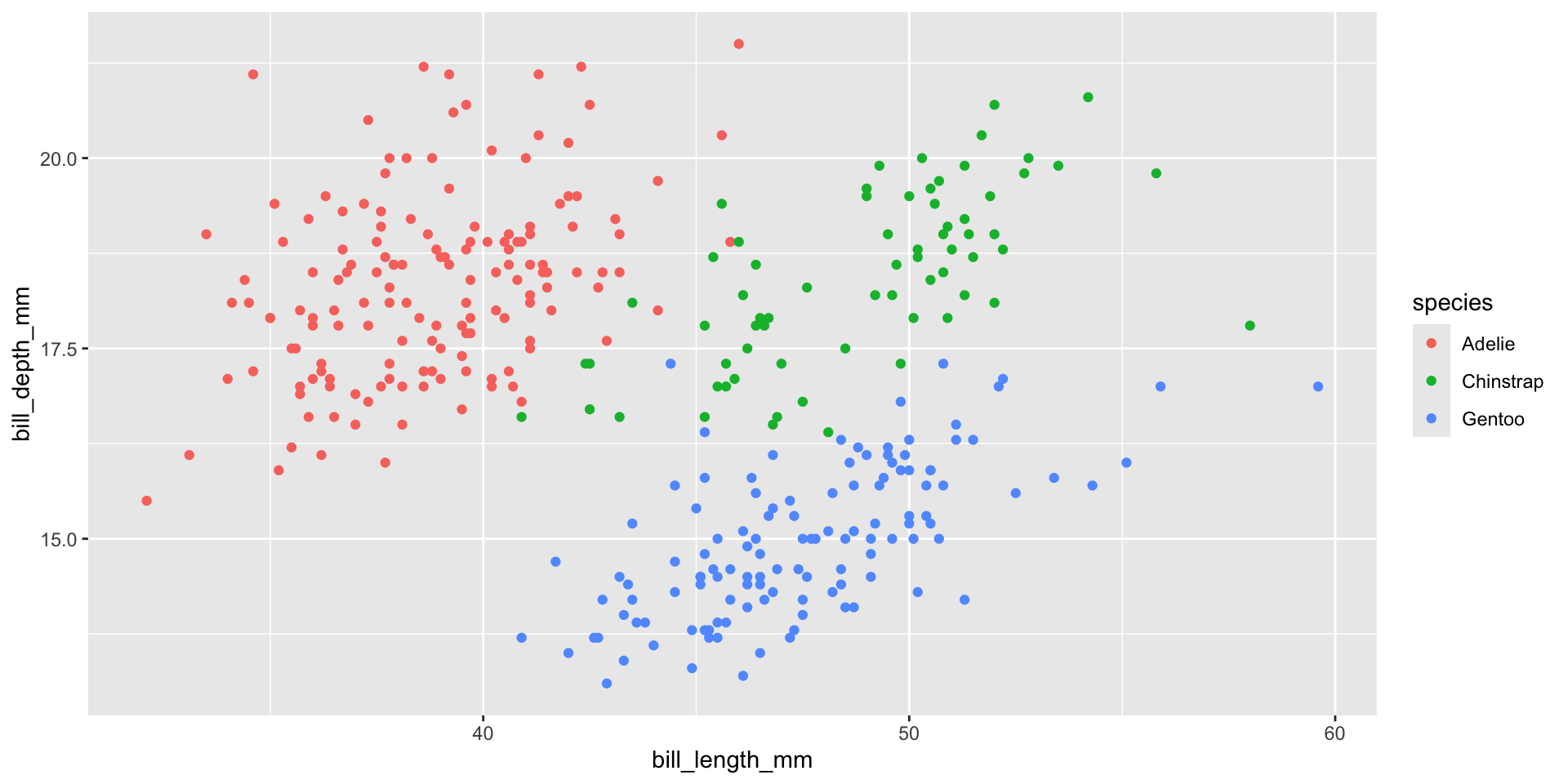
Adding colour by species

ggplot(data = penguins,
       aes(x = bill_length_mm, y = bill_depth_mm, color = species)) +
  geom_point()

Mystery solved — the three “clusters” are actually the three penguin species! This is the power of mapping a variable to color inside aes().

aes() outside vs inside geom_point()

# Option A: mapping applies to ALL layers
ggplot(penguins, aes(x = bill_length_mm, y = bill_depth_mm, color = species)) +
  geom_point()

# Option B: mapping applies ONLY to this geom layer
ggplot(penguins, aes(x = bill_length_mm, y = bill_depth_mm)) +
  geom_point(aes(color = species))

Both give the same result here — but Option B is useful once we start layering multiple geoms (Session 2!).

Your Turn 3 (7 min)

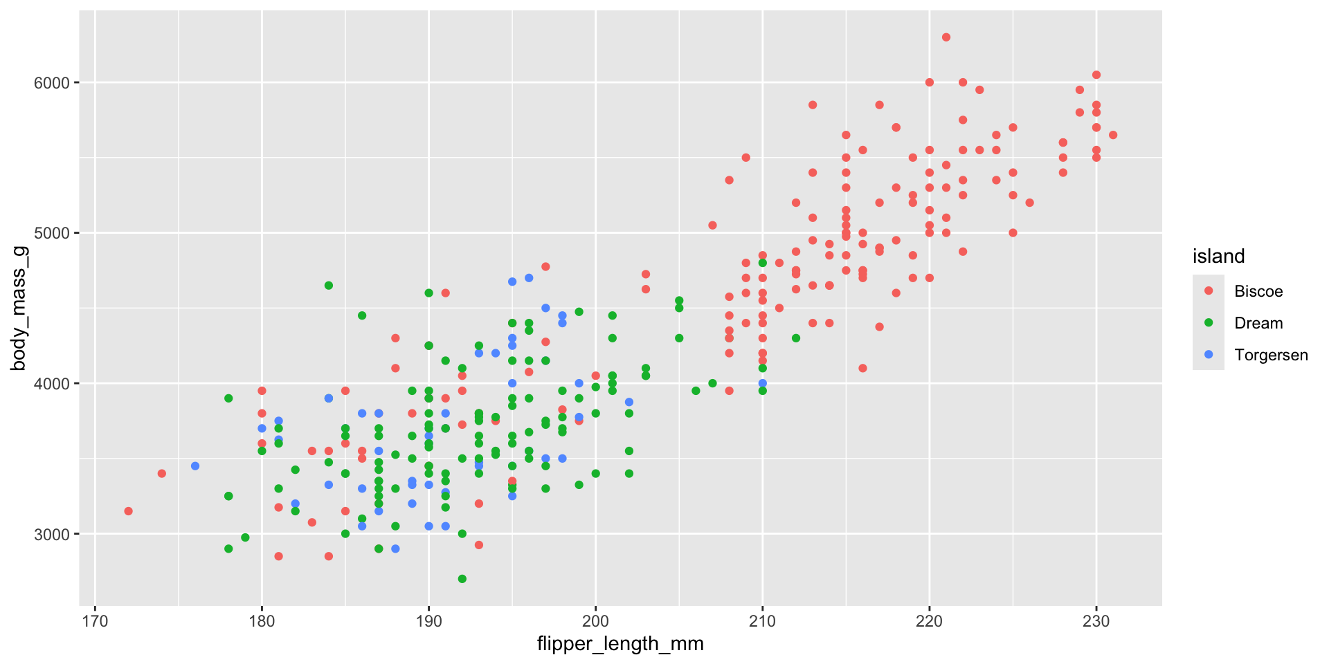
Make a scatter plot of flipper_length_mm vs body_mass_g, colouring the points by island instead of species.
Answer

ggplot(data = penguins,
       aes(x = flipper_length_mm, y = body_mass_g, color = island)) +
  geom_point()

Notice the colours are more mixed up here than with species — island doesn’t separate the penguins nearly as cleanly. That itself is a useful finding!

Bar Charts — Counting Categories

When to use a bar chart

  • Scatter plots need two numeric variables
  • When you want to count how many rows fall into each category, use geom_bar()
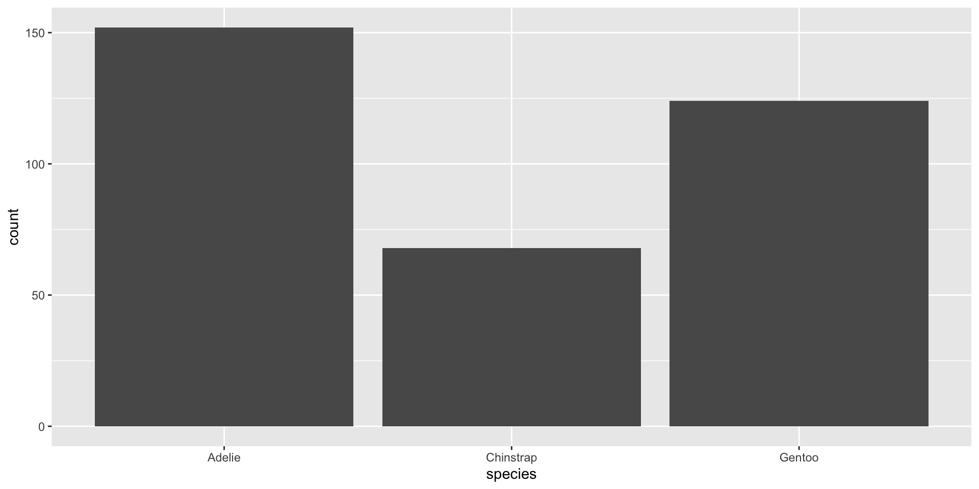
ggplot(data = penguins, aes(x = species)) +
  geom_bar()

Notice: we only supplied one aesthetic (x). geom_bar() automatically counts rows for us — we didn’t need to calculate counts ourselves!

Colouring bars
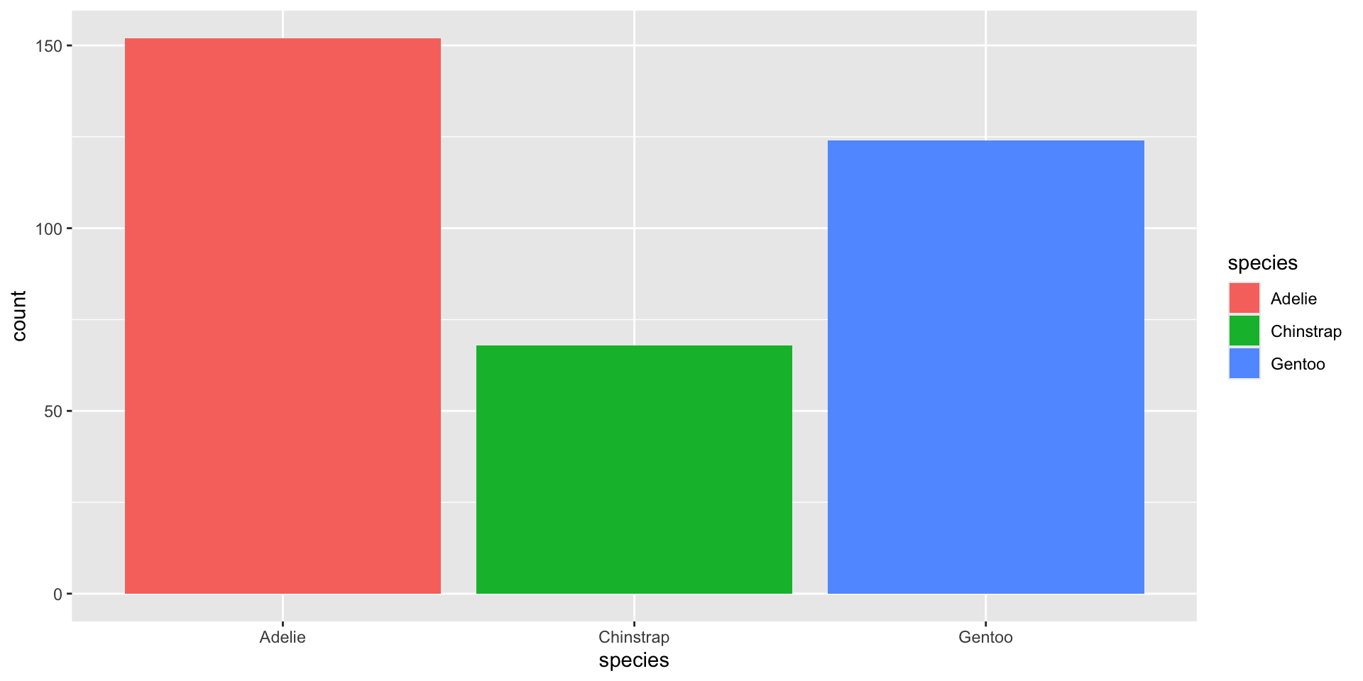
ggplot(data = penguins, aes(x = species, fill = species)) +
  geom_bar()

For bars/areas we usually use fill (the inside colour) rather than color (the outline colour). Try swapping fill for color above and see the difference!

Your Turn 4 (8 min)

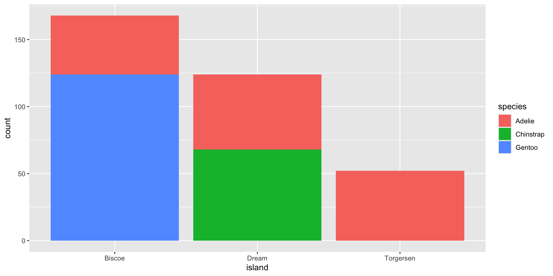
  1. Make a bar chart showing how many penguins were recorded on each island
  2. Fill the bars by species — what do you notice about which species live on which islands?
Answer

ggplot(data = penguins, aes(x = island, fill = species)) +
  geom_bar()

Torgersen only has Adelie penguins; Biscoe has mostly Gentoo (and some Adelie); Dream has Adelie and Chinstrap. Stacked bars like this let us see two categorical variables at once.

Recap — Session 1

  • R is the engine, RStudio is the dashboard
  • <- stores values in named objects
  • install.packages() once, library() every session
  • penguins from palmerpenguins is our practice dataset all workshop
  • Every ggplot2 plot = data + aes + geom, joined with +
  • geom_point() → scatter plots (two numeric variables)
  • geom_bar() → counts of a categorical variable
  • color/fill inside aes() map a variable to colour

Before Session 2

Practice at home (10 min):

# 1. Make a scatter plot of bill_length_mm vs flipper_length_mm
# 2. Colour it by sex
# 3. Make a bar chart of `sex` counts, coloured by species

Bring any error messages you get — we will debug them together in Session 2!

Next session: aesthetics deep-dive (size, shape, transparency), histograms, boxplots, density plots, and facets — splitting one plot into a grid of small multiples.

Thank you!

Session 1 complete 🎉

Questions? Errors on your screen? Raise your hand — we fix them together, not alone.

SARA Institute of Data Science — building open, first-generation, Ambedkarite research capacity, one dataset at a time.