Data Visualisation with R

Session 2 · Grammar of Graphics — Aesthetics, Geoms & Facets

SARA Institute of Data Science

2026-07-21

Welcome back!

  • Session 1 recap: ggplot(data, aes(x, y)) + geom_...()
  • Today we go deeper into the grammar:
    • more aesthetics (size, shape, alpha, transparency)
    • more geoms (histogram, boxplot, density, smooth line)
    • facets — many small plots from one line of code
  • By the end: you’ll be able to explore almost any dataset visually

Quick recap exercise (5 min)

Recreate this from memory (don’t peek at Session 1 notes yet!):

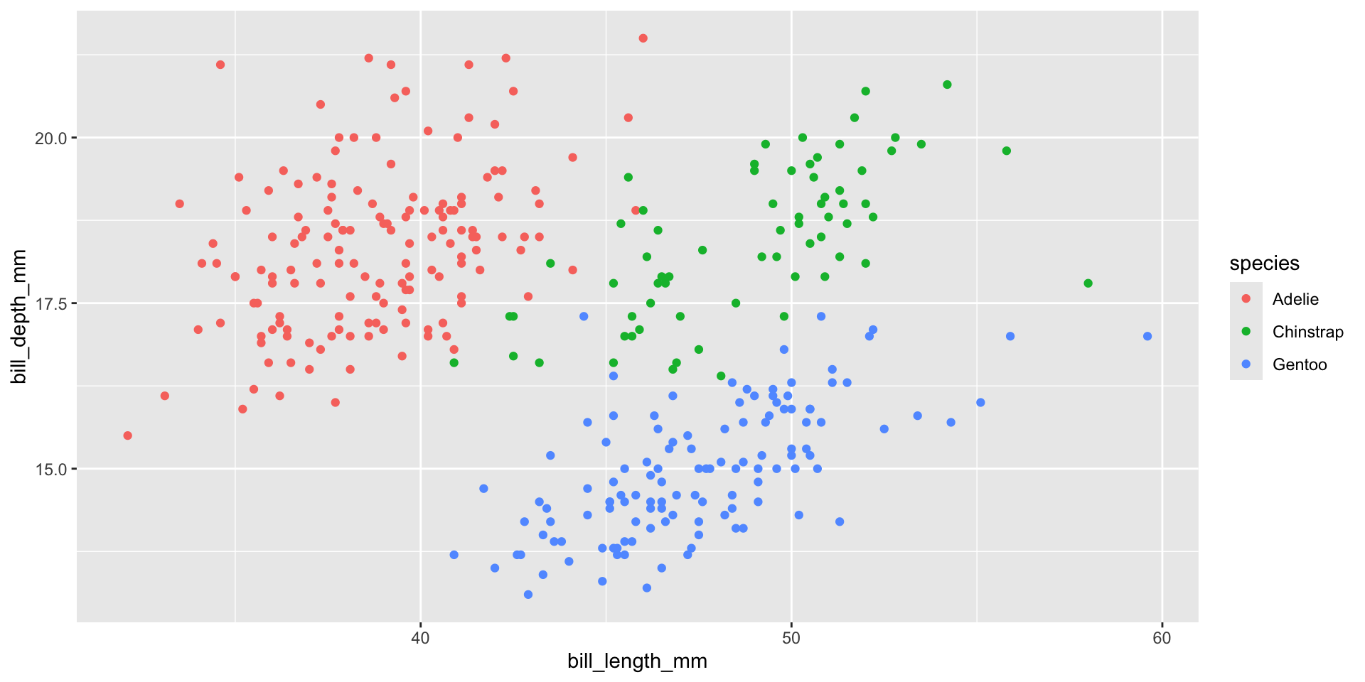
A scatter plot of bill_length_mm (x) vs bill_depth_mm (y), coloured by species.

ggplot(penguins, aes(x = bill_length_mm, y = bill_depth_mm, color = species)) +
  geom_point()

Session 2 roadmap

Time Topic
0–10 min Recap + more aesthetics (size, shape, alpha)
10–25 min Trend lines with geom_smooth()
25–45 min Distributions: histograms & density plots
45–65 min Comparing groups: boxplots
65–85 min Facets — small multiples
85–90 min Wrap-up

More Aesthetics

Beyond colour: size, shape, and alpha

Aesthetics aren’t limited to x, y, and color. We can also map data to:

  • size — bigger/smaller points
  • shape — different point symbols
  • alpha — transparency (0 = invisible, 1 = solid)
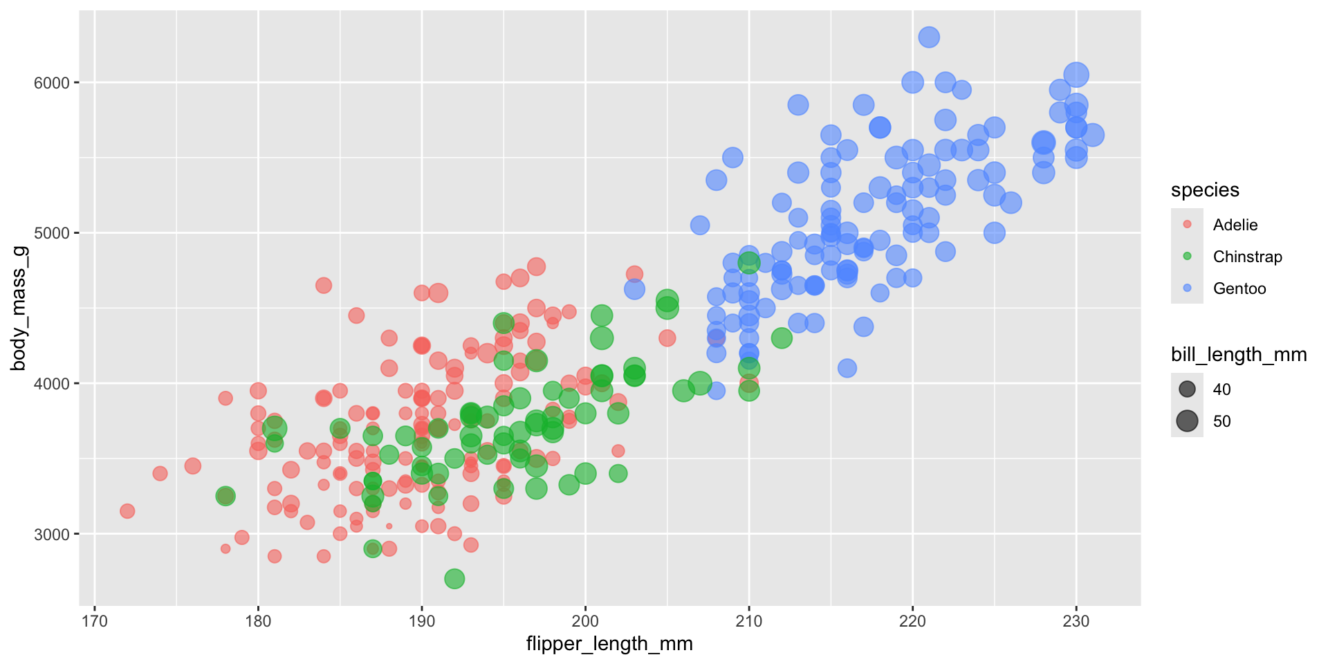
ggplot(penguins, aes(x = flipper_length_mm, y = body_mass_g,
                     color = species, size = bill_length_mm)) +
  geom_point(alpha = 0.6)

Notice: alpha = 0.6 is set outside aes(), directly inside geom_point(). That’s because we’re not mapping it to a variable — we’re setting one fixed value for every point. This is a key distinction in ggplot2.

Mapped vs. fixed — the golden rule

Inside aes() Outside aes()
Value comes from a column in your data Value is the same for every point
aes(color = species) color = "steelblue"
aes(size = bill_length_mm) size = 3
Varies per row Fixed by you
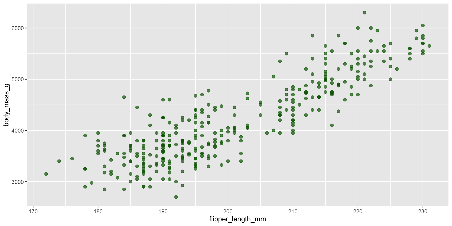
# Fixed color and size for ALL points - no legend needed
ggplot(penguins, aes(x = flipper_length_mm, y = body_mass_g)) +
  geom_point(color = "darkgreen", size = 2, alpha = 0.7)

Your Turn 1 (7 min)

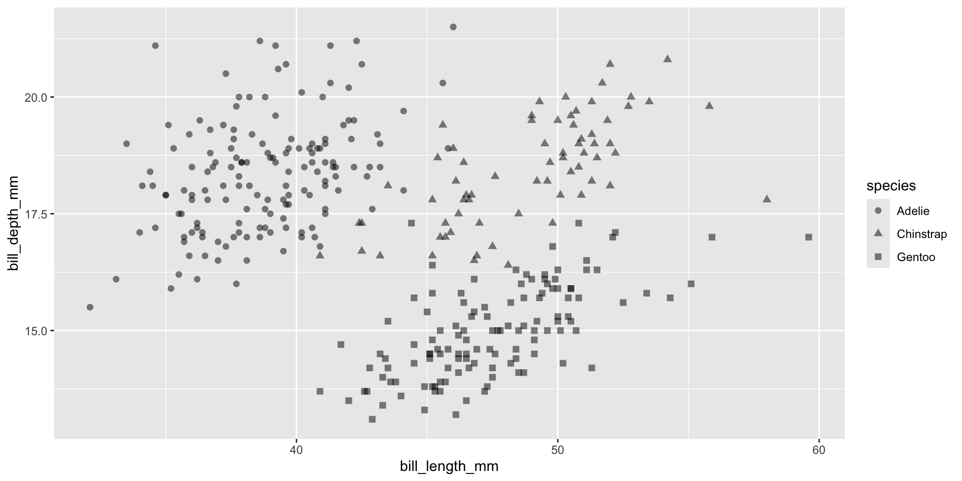
  1. Plot bill_length_mm vs bill_depth_mm
  2. Map shape to species
  3. Set a fixed alpha = 0.5 and size = 2 (not mapped — just typed directly)

Answer

ggplot(penguins, aes(x = bill_length_mm, y = bill_depth_mm, shape = species)) +
  geom_point(alpha = 0.5, size = 2)

Trend Lines

Adding a trend line with geom_smooth()
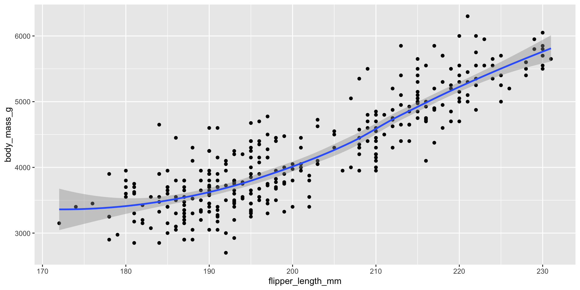
ggplot(penguins, aes(x = flipper_length_mm, y = body_mass_g)) +
  geom_point() +
  geom_smooth()

Two geoms, one plot — this is layering. geom_smooth() fits a curve through the data (a “loess” curve by default) with a shaded confidence band.

A straight-line trend instead
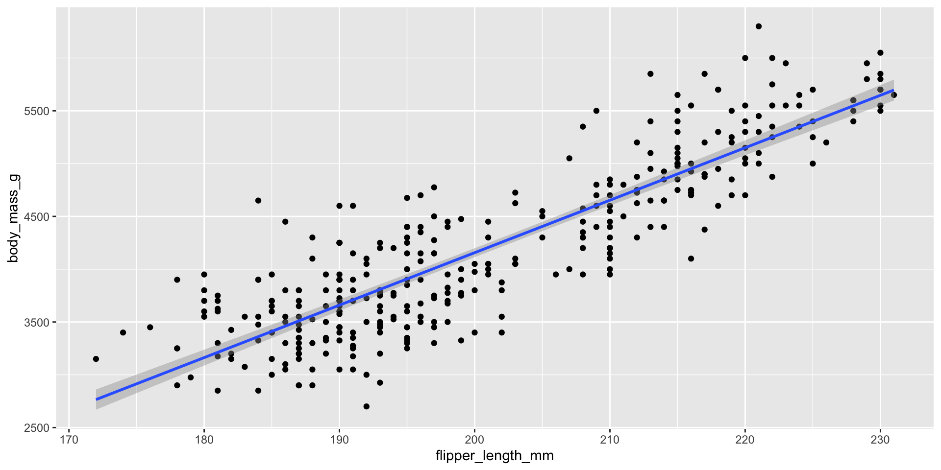
ggplot(penguins, aes(x = flipper_length_mm, y = body_mass_g)) +
  geom_point() +
  geom_smooth(method = "lm")

method = "lm" fits a straight linear model instead of a curve — useful when you specifically want to show a linear relationship.

Trend lines per group
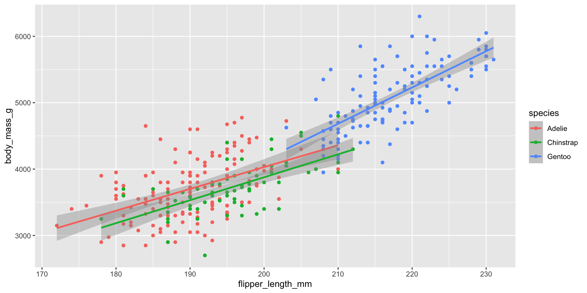
ggplot(penguins, aes(x = flipper_length_mm, y = body_mass_g, color = species)) +
  geom_point() +
  geom_smooth(method = "lm")

Because color = species was set in the shared aes(), both geom_point() and geom_smooth() inherit it — giving us one trend line per species automatically!

Your Turn 2 (8 min)

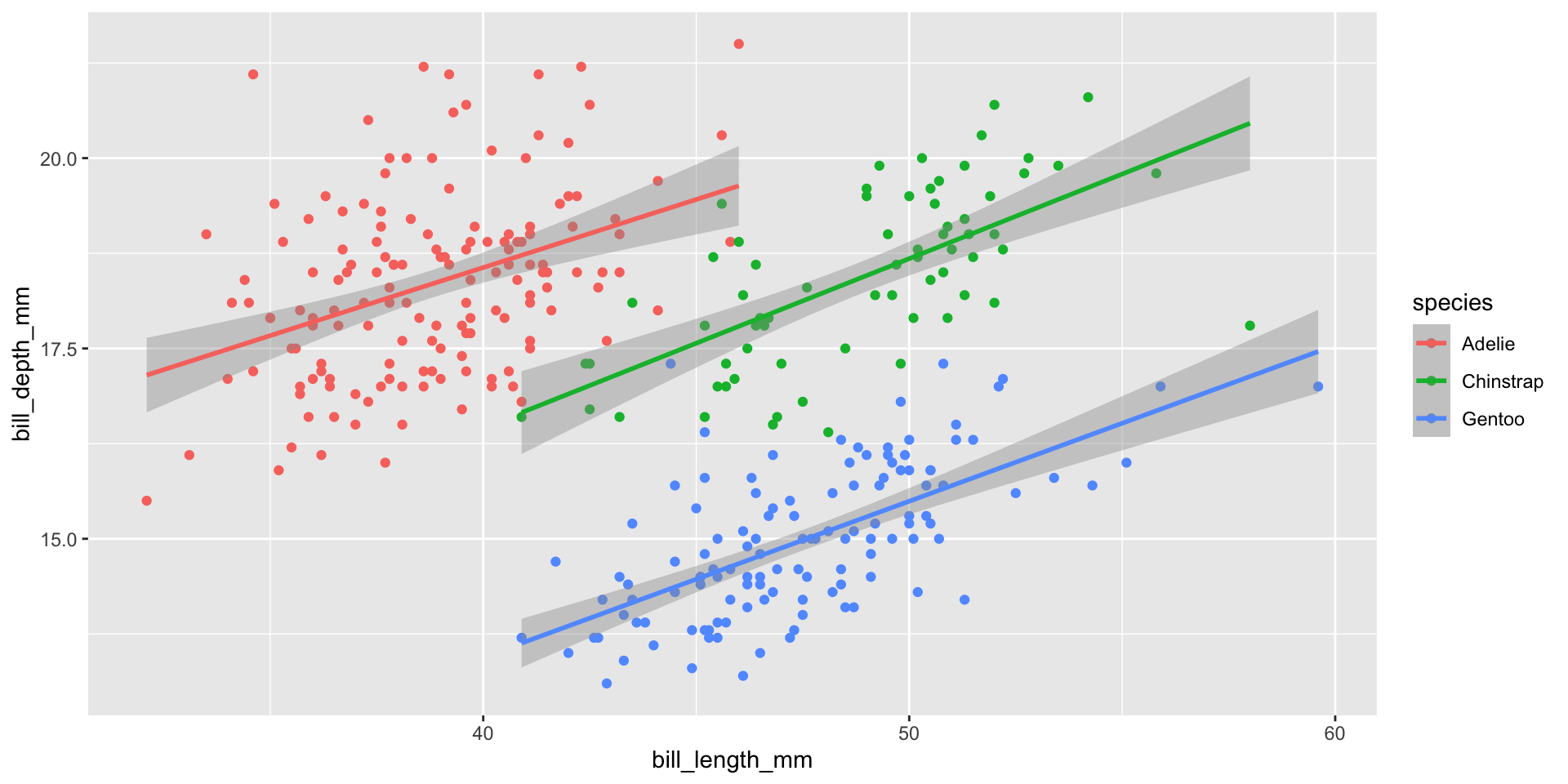
Plot bill_length_mm (x) vs bill_depth_mm (y):

  1. Points coloured by species
  2. Add a linear ("lm") trend line — one per species

What do you notice about the overall trend vs. each species’ trend? (This is a classic case of Simpson’s Paradox!)
Answer

ggplot(penguins, aes(x = bill_length_mm, y = bill_depth_mm, color = species)) +
  geom_point() +
  geom_smooth(method = "lm")

Overall, bill length and depth look negatively related — but within each species, the relationship is positive! Always check whether hidden groups are driving a trend.

Exploring Distributions

Histograms — one numeric variable

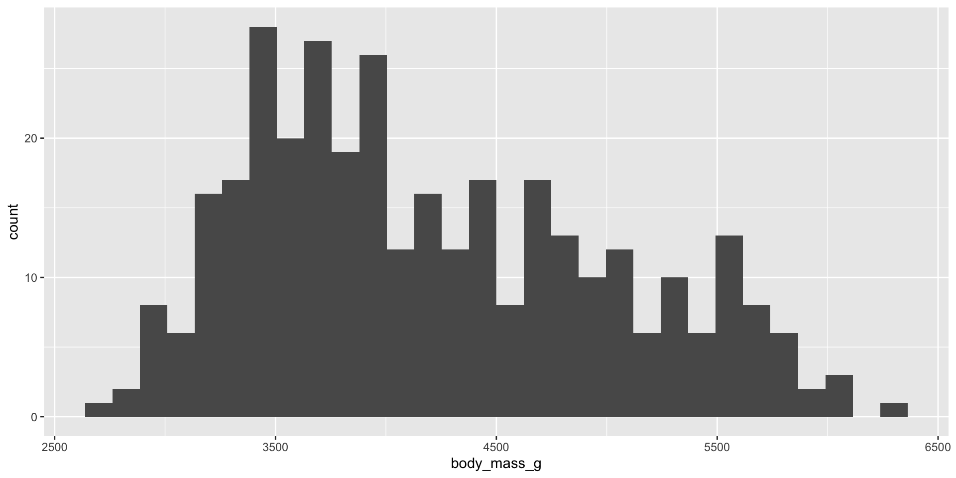
ggplot(penguins, aes(x = body_mass_g)) +
  geom_histogram()

R gives a friendly warning about bin count — histograms group numeric values into bins and count how many rows fall in each.

Controlling bin width
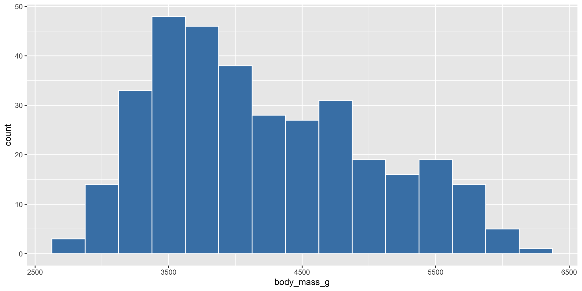
ggplot(penguins, aes(x = body_mass_g)) +
  geom_histogram(binwidth = 250, fill = "steelblue", color = "white")
  • Smaller binwidth → more detail, more noise
  • Larger binwidth → smoother, but may hide real patterns
  • There is no single “correct” binwidth — try a few!

Histograms by group
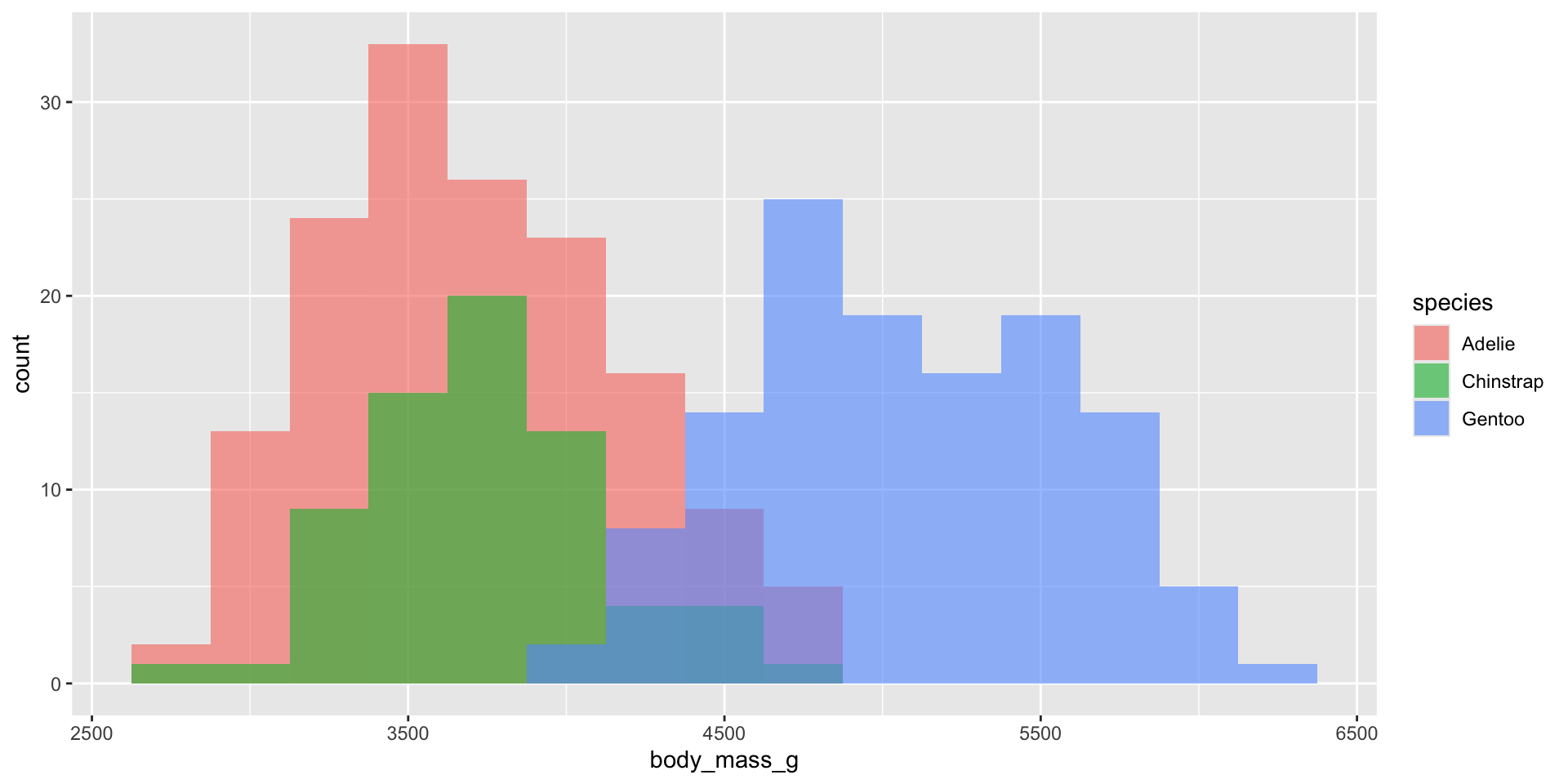
ggplot(penguins, aes(x = body_mass_g, fill = species)) +
  geom_histogram(binwidth = 250, alpha = 0.6, position = "identity")

position = "identity" lets the three histograms overlap rather than stack — combined with alpha, we can see all three at once.

Density plots — a smooth alternative
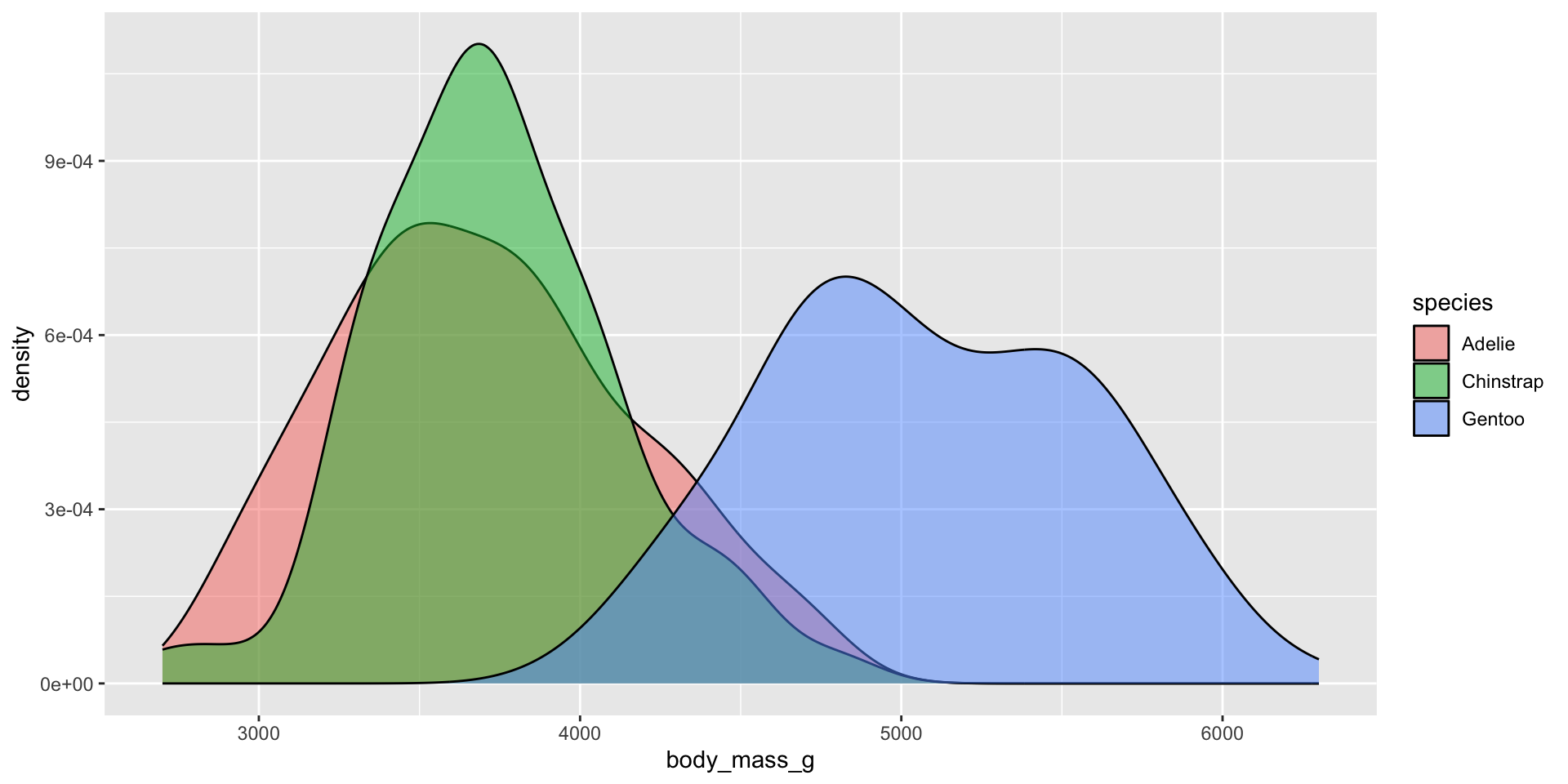
ggplot(penguins, aes(x = body_mass_g, fill = species)) +
  geom_density(alpha = 0.5)

A density plot is like a smoothed histogram — useful for comparing shapes of distributions across groups without worrying about binwidth.

Your Turn 3 (8 min)

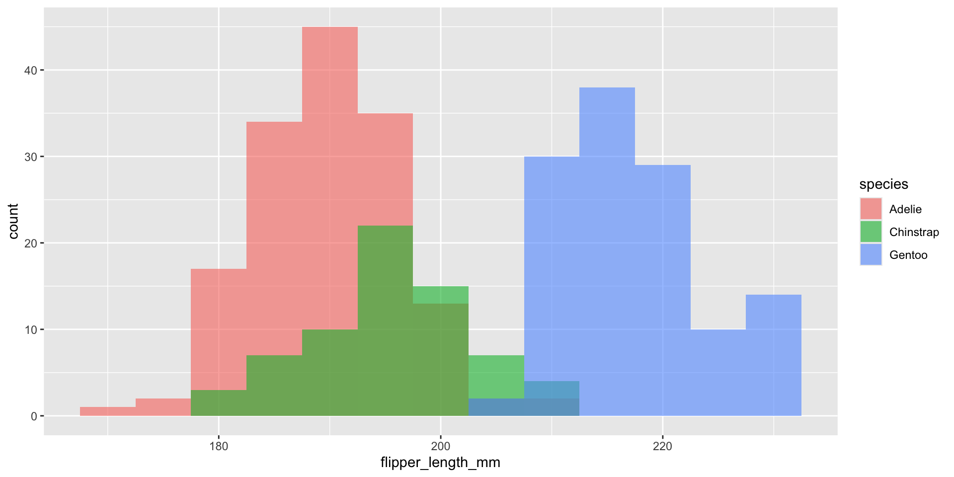
  1. Make a histogram of flipper_length_mm with binwidth = 5
  2. Fill it by species, with alpha = 0.6 and position = "identity"

Answer

ggplot(penguins, aes(x = flipper_length_mm, fill = species)) +
  geom_histogram(binwidth = 5, alpha = 0.6, position = "identity")

Comparing Groups

Boxplots

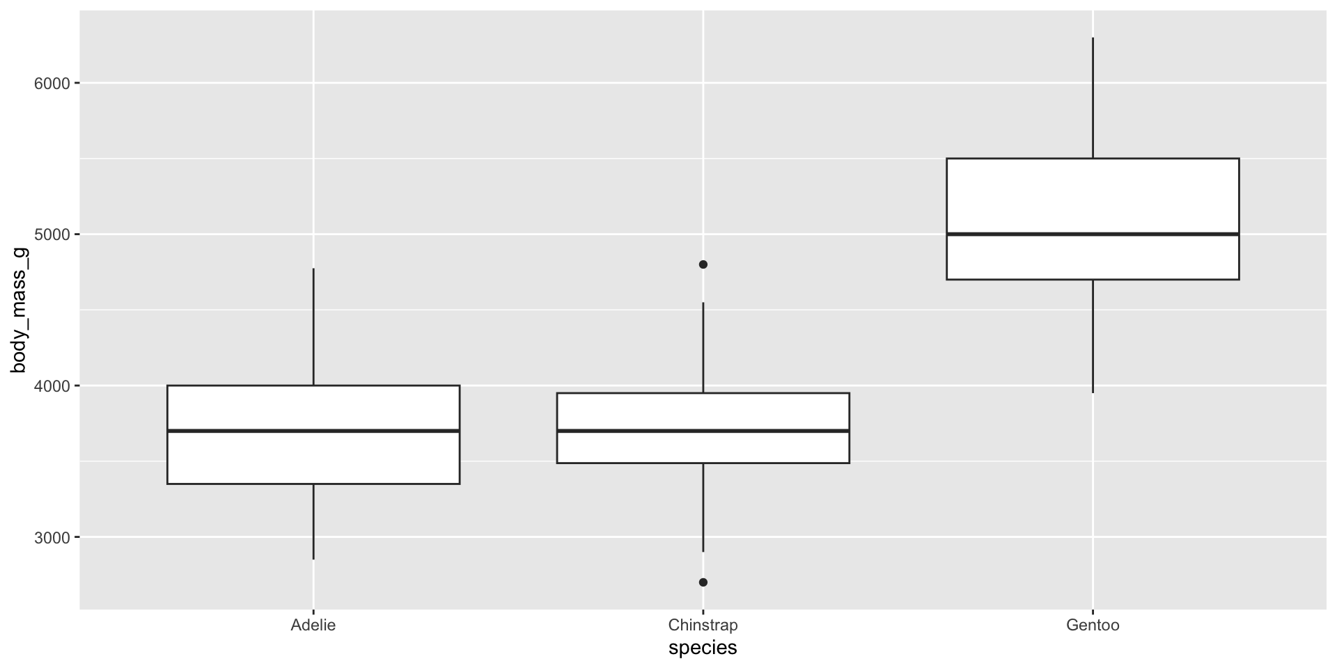
ggplot(penguins, aes(x = species, y = body_mass_g)) +
  geom_boxplot()

Reading a boxplot:

  • box = middle 50% of the data (25th–75th percentile)
  • thick line = median
  • whiskers = typical range
  • dots beyond whiskers = potential outliers

Boxplots with colour
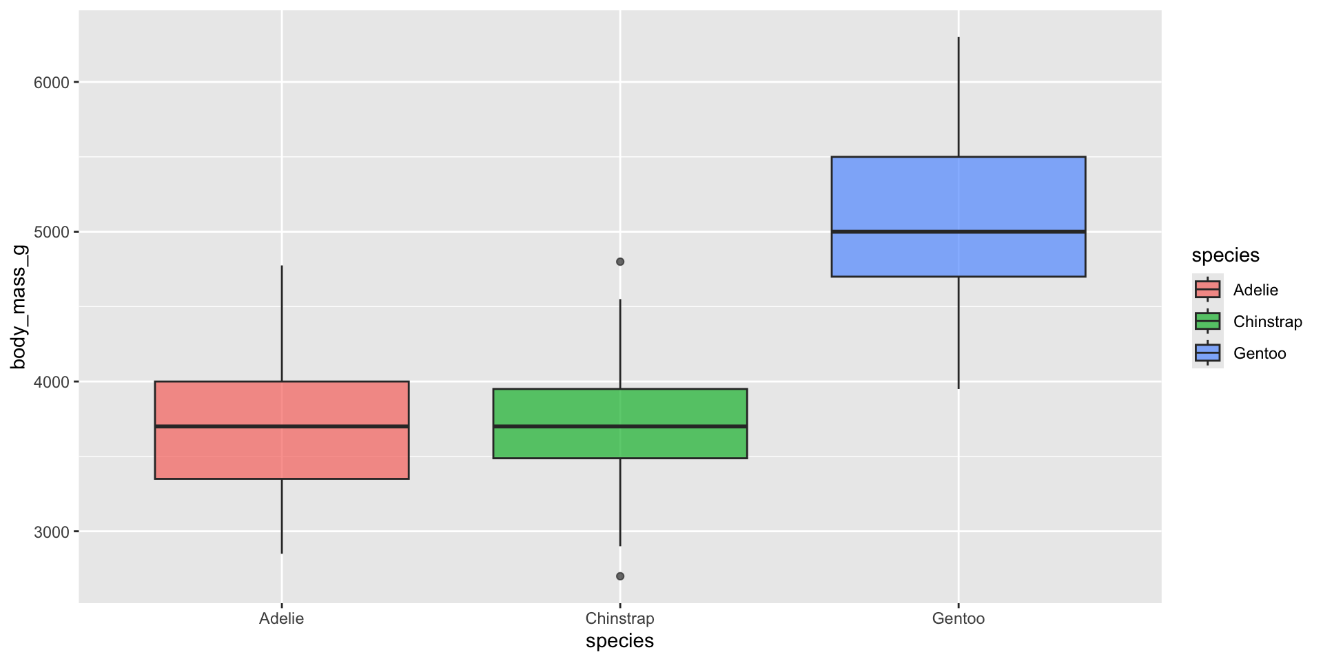
ggplot(penguins, aes(x = species, y = body_mass_g, fill = species)) +
  geom_boxplot(alpha = 0.7)

Adding fill = species is slightly redundant with x = species here, but it makes group boundaries easier to see at a glance, especially in printed handouts.

Adding raw data points on top
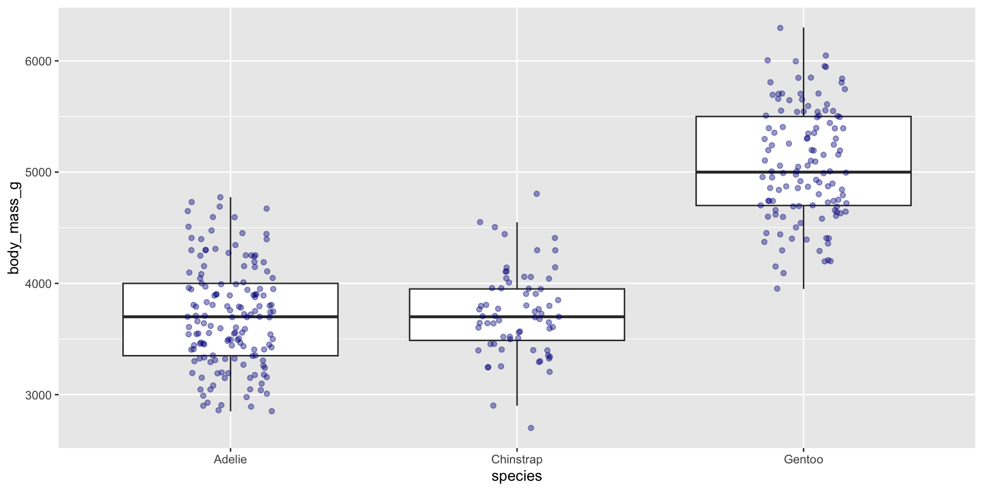
ggplot(penguins, aes(x = species, y = body_mass_g)) +
  geom_boxplot(outlier.shape = NA) +
  geom_jitter(width = 0.15, alpha = 0.4, color = "darkblue")

geom_jitter() nudges overlapping points sideways randomly so we can see individual data — this shows both the summary (boxplot) and the raw data (jittered points) together.

Your Turn 4 (8 min)

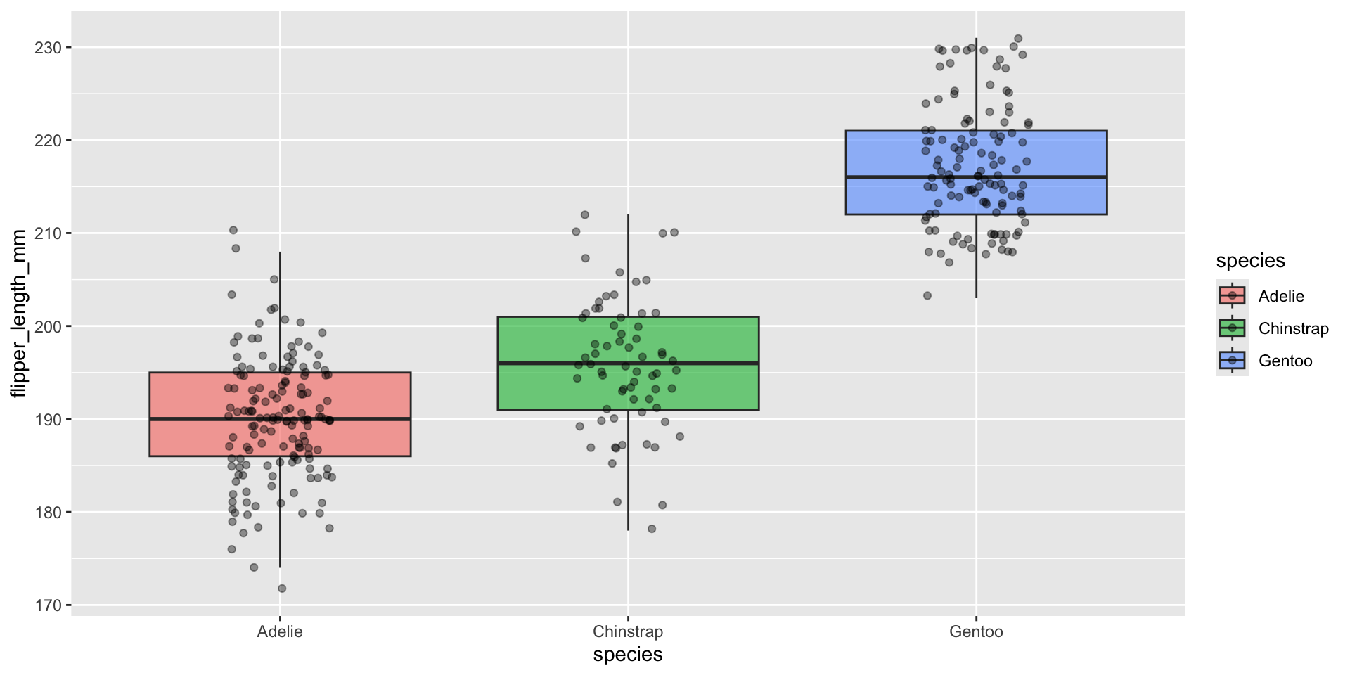
Make a boxplot of flipper_length_mm by species, filled by species, with jittered points on top.
Answer

ggplot(penguins, aes(x = species, y = flipper_length_mm, fill = species)) +
  geom_boxplot(alpha = 0.6, outlier.shape = NA) +
  geom_jitter(width = 0.15, alpha = 0.4)

Facets — Small Multiples

The problem facets solve

  • Sometimes colour alone gets too crowded with 3+ groups, or we want groups fully separated, not overlapping
  • Facets split one plot into a grid — one panel per category

facet_wrap() — one variable

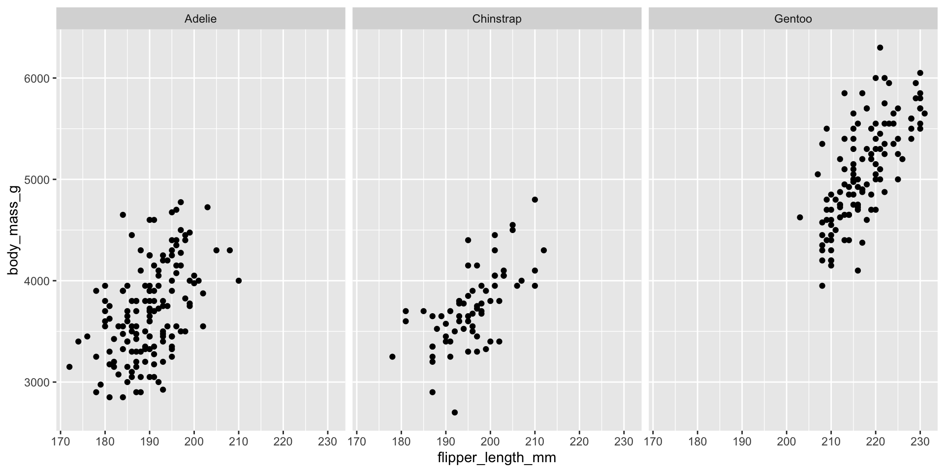
ggplot(penguins, aes(x = flipper_length_mm, y = body_mass_g)) +
  geom_point() +
  facet_wrap(~species)

The ~species means “split by species.” Each panel shows the same x/y axes, just filtered to one species’ data.

facet_grid() — two variables at once
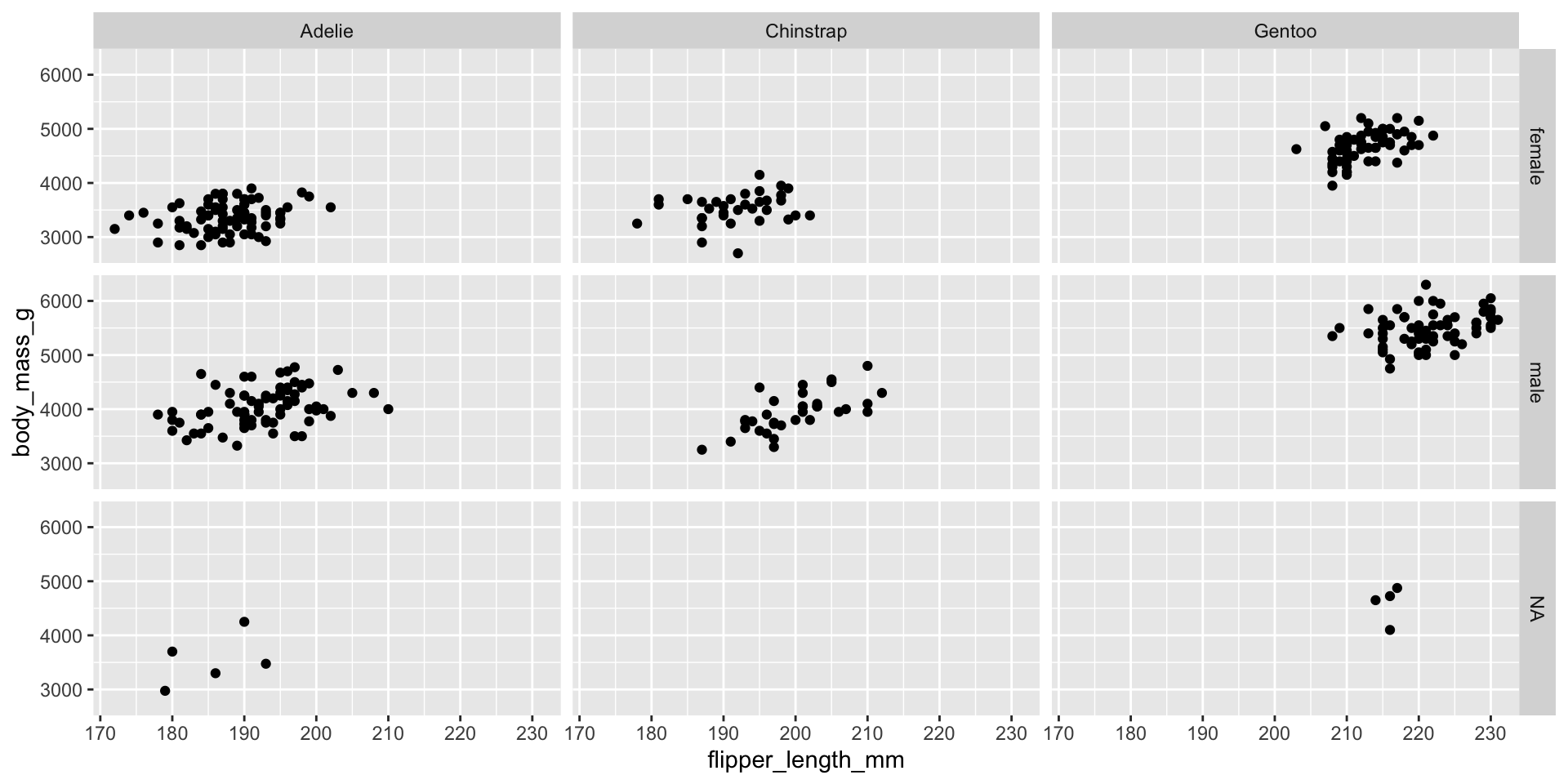
ggplot(penguins, aes(x = flipper_length_mm, y = body_mass_g)) +
  geom_point() +
  facet_grid(sex ~ species)

facet_grid(rows ~ columns) creates a full grid: rows = sex, columns = species. Great for comparing two categorical variables simultaneously. (Note: a few penguins have missing sex — we’ll handle missing data more in Session 3.)

Combining facets with colour
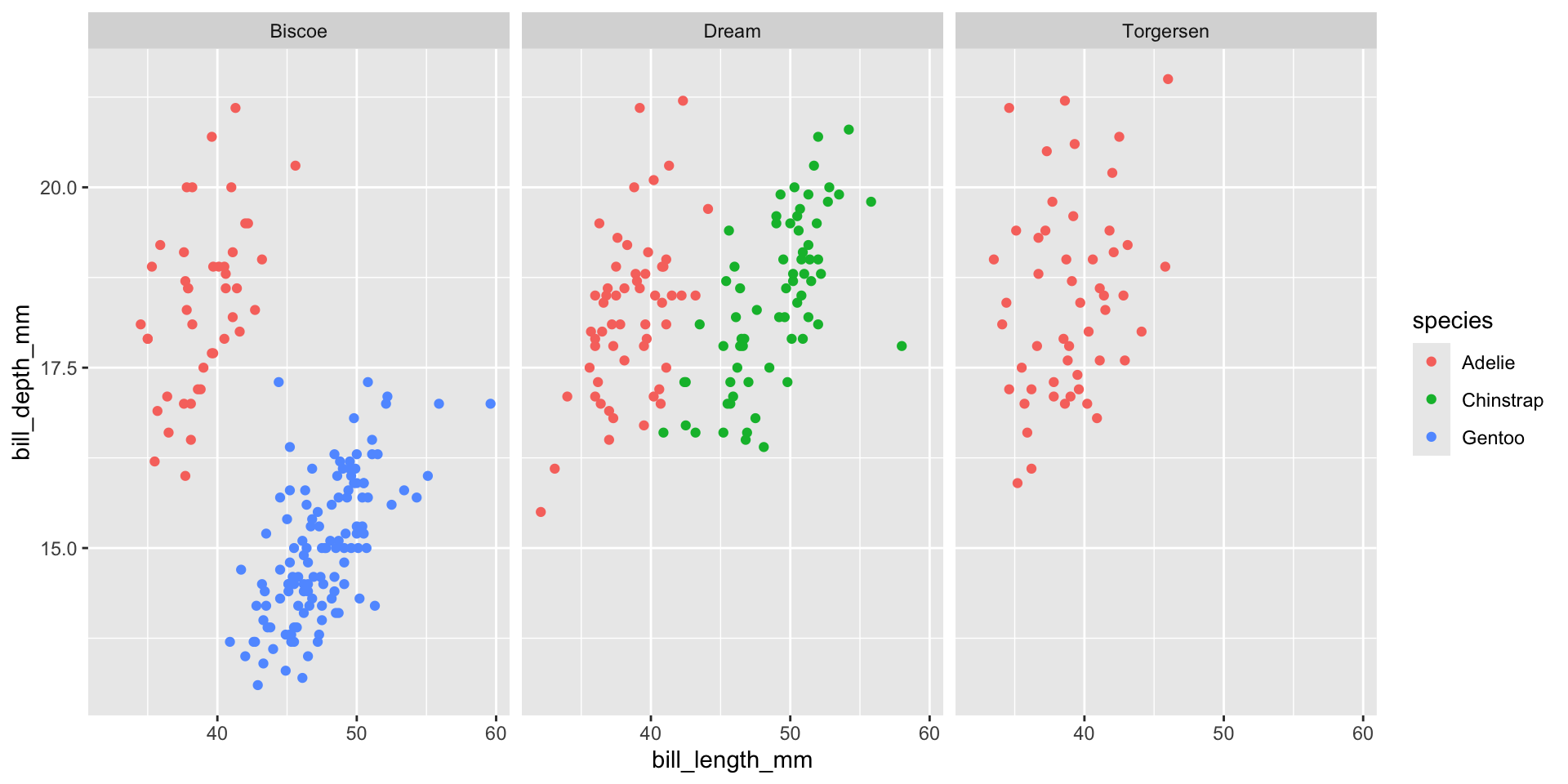
ggplot(penguins, aes(x = bill_length_mm, y = bill_depth_mm, color = species)) +
  geom_point() +
  facet_wrap(~island)

Facets and aesthetics work together nicely — here we see, per island, how species separate by bill measurements.

Your Turn 5 (10 min)

  1. Make a histogram of body_mass_g
  2. Facet it by species using facet_wrap()
  3. Bonus: also facet by sex using facet_grid(sex ~ species)

Answer

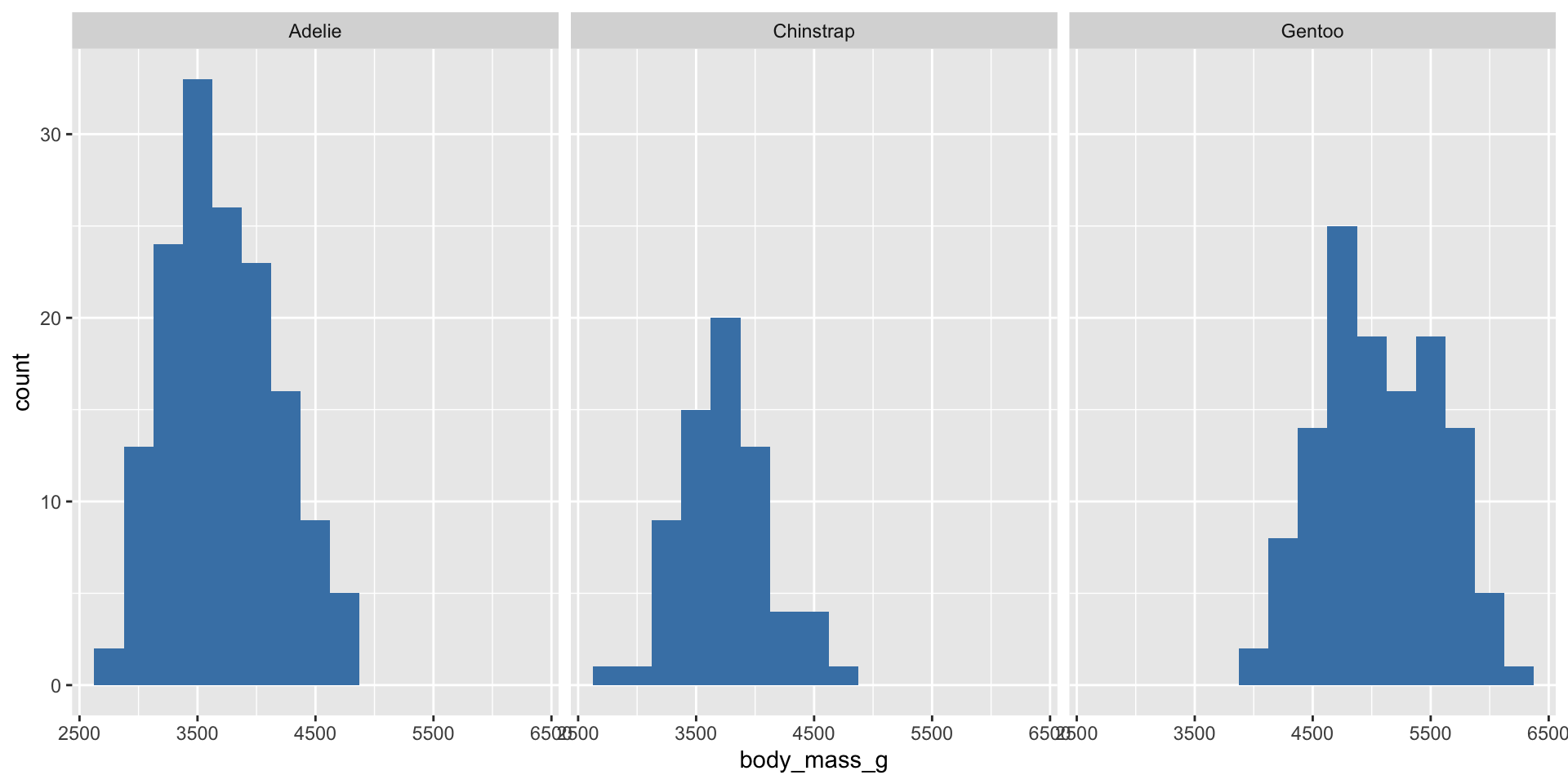
ggplot(penguins, aes(x = body_mass_g)) +
  geom_histogram(binwidth = 250, fill = "steelblue") +
  facet_wrap(~species)

ggplot(penguins, aes(x = body_mass_g)) +
  geom_histogram(binwidth = 250, fill = "steelblue") +
  facet_grid(sex ~ species)

Recap — Session 2

  • Aesthetics mapped inside aes() vary by data; values set outside aes() are fixed
  • geom_smooth() adds trend lines — watch for group-level reversals (Simpson’s Paradox!)
  • geom_histogram() / geom_density() show the shape of one numeric variable
  • geom_boxplot() compares a numeric variable across groups; geom_jitter() shows raw data on top
  • facet_wrap(~var) and facet_grid(row ~ col) split one plot into small multiples

Before Session 3

Practice at home:

# 1. Make a density plot of bill_depth_mm, filled by island
# 2. Facet a boxplot of body_mass_g by species AND sex
# 3. Notice: none of our plots have proper titles yet - we'll fix that next!

Next session: Titles & labels, themes, custom colour palettes, coord_flip(), and — crucially — saving your plots with ggsave() so they’re ready for your paper, poster, or presentation.

Thank you!

Session 2 complete 🎉

SARA Institute of Data Science — building open, first-generation, Ambedkarite research capacity, one dataset at a time.