Data Visualisation with R

Session 3 · Polishing & Publishing — Labels, Themes, Scales & Saving

SARA Institute of Data Science

2026-07-21

Welcome back!

  • Session 1: grammar basics — data + aes + geom
  • Session 2: more aesthetics, more geoms, facets
  • Session 3 (today): turning a working plot into a publication-ready plot
    • titles, labels, captions
    • themes and colour palettes
    • flipping coordinates
    • saving plots as files for your paper/poster
    • mini project + wrap-up

Session 3 roadmap

Time Topic
0–10 min Recap + why “finishing touches” matter
10–25 min Titles, axis labels, captions with labs()
25–40 min Themes — theme_minimal(), theme_bw(), custom theme()
40–55 min Colour palettes — manual, ColorBrewer, viridis
55–65 min coord_flip() and reordering categories
65–75 min Saving plots with ggsave()
75–90 min Mini project + wrap-up

Why finishing touches matter

  • A plot with no title/labels forces the reader to guess what they’re looking at
  • Reviewers, examiners, and funders judge credibility partly by presentation
  • Good defaults + small, deliberate customisation > over-decorated “chart-junk”

Today’s plots will look noticeably more “professional” — using the same grammar you already know, plus a few new functions.

Titles & Labels

Adding titles with labs()

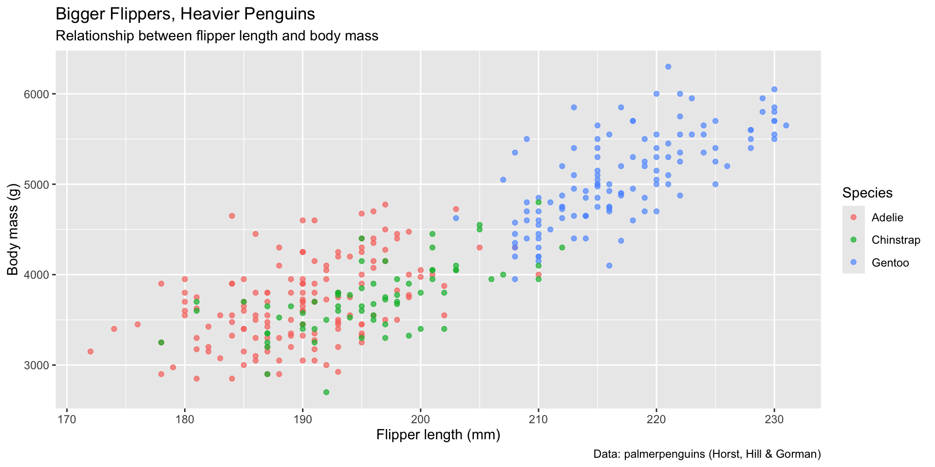
ggplot(penguins, aes(x = flipper_length_mm, y = body_mass_g, color = species)) +
  geom_point(alpha = 0.7) +
  labs(
    title = "Bigger Flippers, Heavier Penguins",
    subtitle = "Relationship between flipper length and body mass",
    x = "Flipper length (mm)",
    y = "Body mass (g)",
    color = "Species",
    caption = "Data: palmerpenguins (Horst, Hill & Gorman)"
  )

labs() is another layer, added with + just like a geom. Every text element a reader sees can be set here: title, subtitle, x, y, color/fill (legend title), and caption (source/credit).

A quick word on data ethics & attribution

  • Always credit your data source — as we just did in the caption
  • The palmerpenguins data itself credits Dr. Kristen Gorman and the Palmer Station Long Term Ecological Research Network
  • Good practice for your own research: cite every dataset you plot, exactly as you’d cite a reference

Your Turn 1 (8 min)

Take your boxplot of body_mass_g by species from Session 2, and add:

  • a title of your choice
  • clear axis labels (not the raw column names!)
  • a caption crediting palmerpenguins

Answer

ggplot(penguins, aes(x = species, y = body_mass_g, fill = species)) +
  geom_boxplot(alpha = 0.7) +
  labs(
    title = "Body Mass Varies Across Penguin Species",
    x = "Species",
    y = "Body mass (g)",
    fill = "Species",
    caption = "Data: palmerpenguins"
  )

Themes

What is a “theme” in ggplot2?

  • A theme controls the non-data ink: background, gridlines, fonts, legend position
  • ggplot2 ships with several ready-made themes
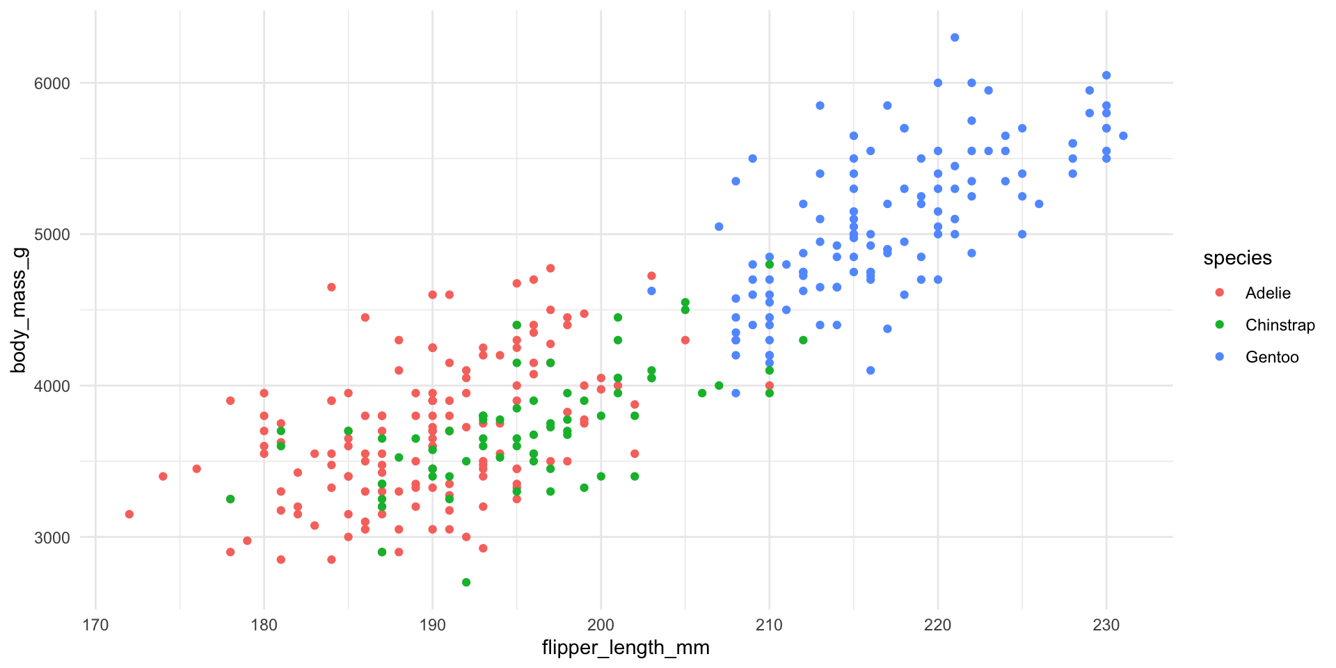
ggplot(penguins, aes(x = flipper_length_mm, y = body_mass_g, color = species)) +
  geom_point() +
  theme_minimal()

Comparing built-in themes

theme_gray()     # the default
theme_minimal()  # clean, no border, light gridlines
theme_bw()       # black & white, gridlines kept
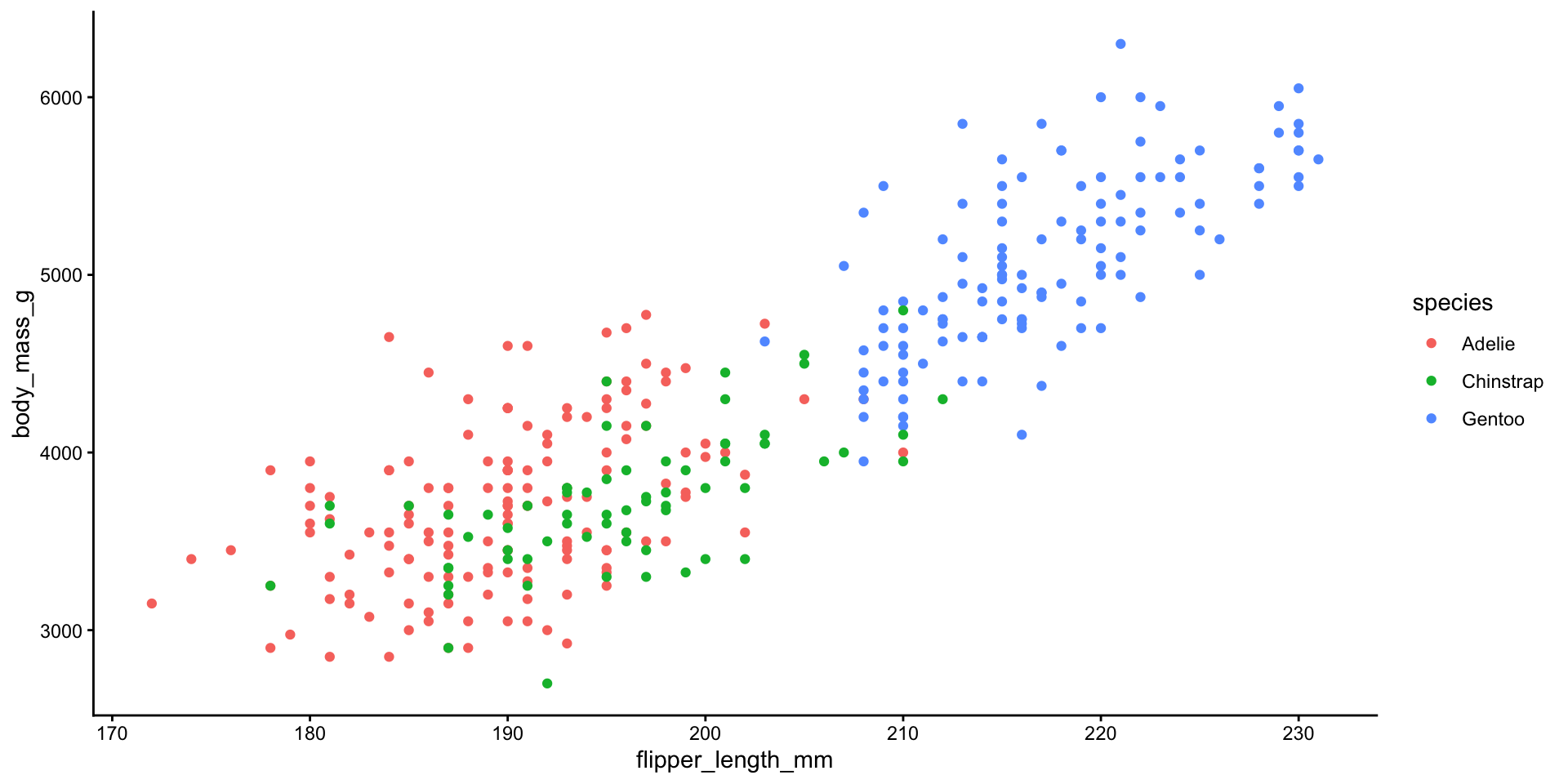
theme_classic()  # only x/y axis lines, no gridlines
theme_void()     # nothing but the data - useful for maps/art
ggplot(penguins, aes(x = flipper_length_mm, y = body_mass_g, color = species)) +
  geom_point() +
  theme_classic()

Fine-tuning with theme()

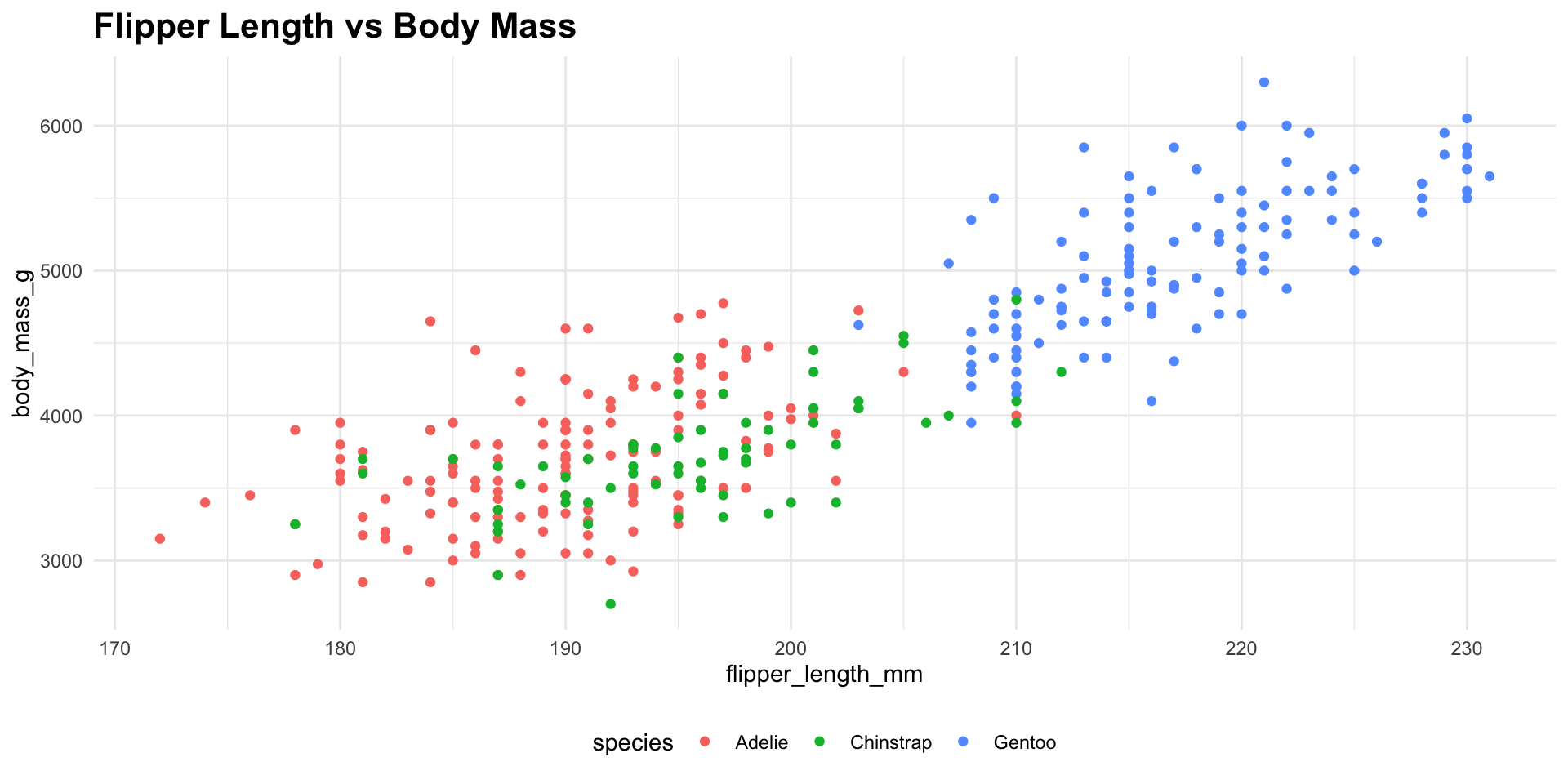
ggplot(penguins, aes(x = flipper_length_mm, y = body_mass_g, color = species)) +
  geom_point() +
  theme_minimal() +
  theme(
    legend.position = "bottom",
    plot.title = element_text(face = "bold", size = 16)
  ) +
  labs(title = "Flipper Length vs Body Mass")

theme() is for fine control (font size, legend position, etc.), while theme_minimal() etc. set a whole package of defaults at once. Use a built-in theme first, then tweak individual elements only if needed.

Your Turn 2 (7 min)

Take any plot from earlier and:

  1. Apply theme_bw()
  2. Move the legend to the "top"

Answer

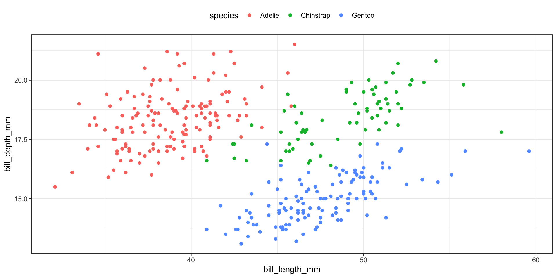
ggplot(penguins, aes(x = bill_length_mm, y = bill_depth_mm, color = species)) +
  geom_point() +
  theme_bw() +
  theme(legend.position = "top")

Colour Palettes

Manual colours

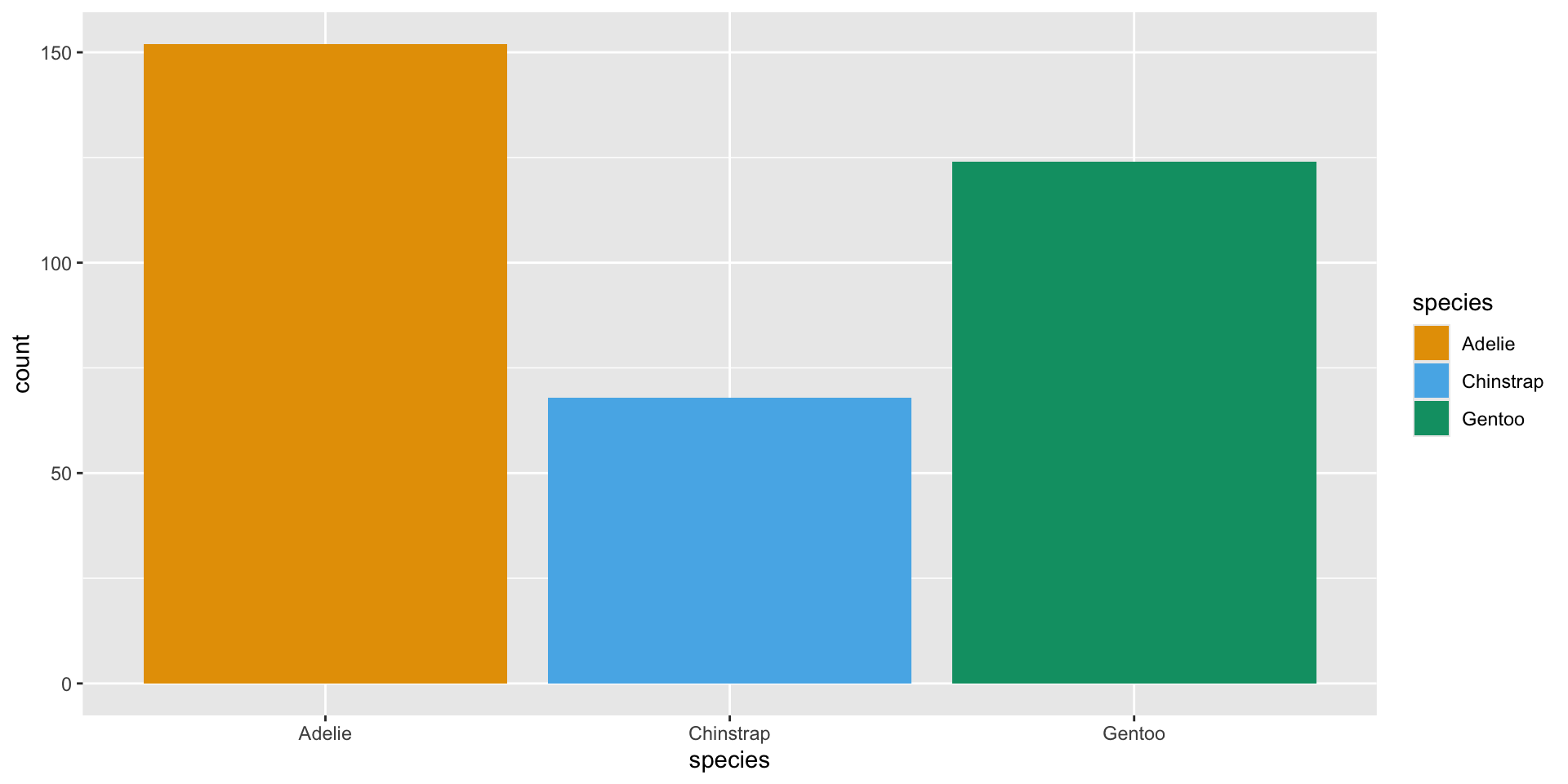
ggplot(penguins, aes(x = species, fill = species)) +
  geom_bar() +
  scale_fill_manual(values = c("Adelie" = "#E69F00",
                                "Chinstrap" = "#56B4E9",
                                "Gentoo" = "#009E73"))

scale_fill_manual() lets you specify exact colours — useful for matching institutional branding or a journal’s style guide.

Colour-blind-friendly palettes

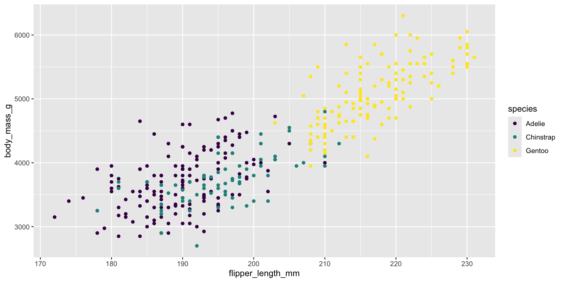
  • Roughly 1 in 12 men have some form of colour-vision deficiency — always consider this in research figures
  • scale_*_brewer() and the viridis palettes are built to be colour-blind safe and print well in grayscale
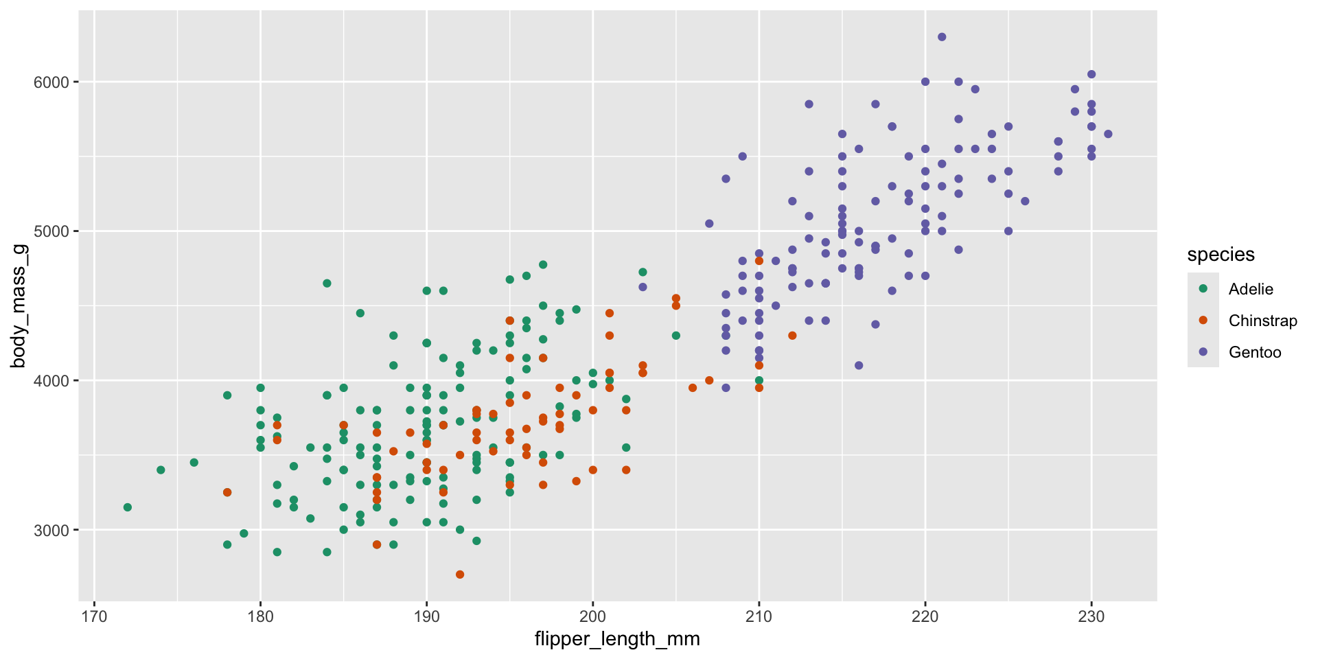
ggplot(penguins, aes(x = flipper_length_mm, y = body_mass_g, color = species)) +
  geom_point() +
  scale_color_brewer(palette = "Dark2")

The viridis palette

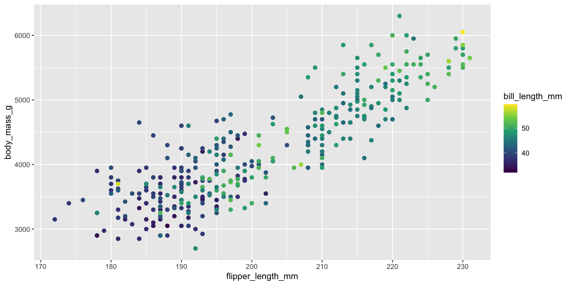
ggplot(penguins, aes(x = flipper_length_mm, y = body_mass_g, color = bill_length_mm)) +
  geom_point(size = 2) +
  scale_color_viridis_c()

Notice: scale_color_viridis_c() (continuous) is for numeric variables like bill_length_mm; for categorical variables like species you’d use scale_color_viridis_d() (discrete).

Your Turn 3 (8 min)

Recreate a scatter plot of flipper_length_mm vs body_mass_g, coloured by species, using:

  1. scale_color_brewer(palette = "Set2")
  2. Then try scale_color_viridis_d() — which do you prefer, and why?

Answer

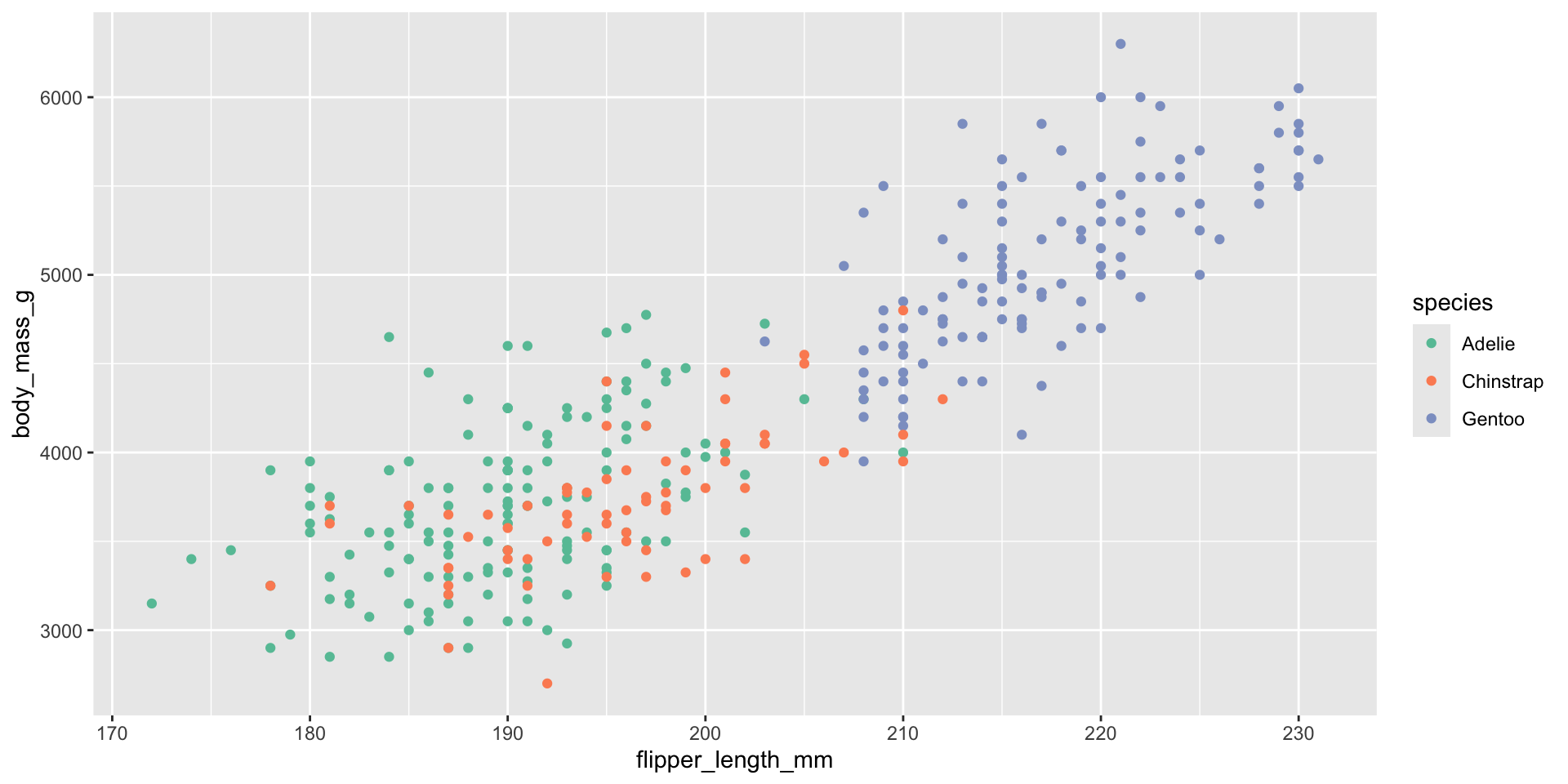
ggplot(penguins, aes(x = flipper_length_mm, y = body_mass_g, color = species)) +
  geom_point() +
  scale_color_brewer(palette = "Set2")

ggplot(penguins, aes(x = flipper_length_mm, y = body_mass_g, color = species)) +
  geom_point() +
  scale_color_viridis_d()

Flipping & Reordering

coord_flip() — horizontal bars

ggplot(penguins, aes(x = species, fill = species)) +
  geom_bar() +
  coord_flip() +
  labs(x = NULL, y = "Count of penguins")

Horizontal bars are often easier to read when category names are long — common in survey/questionnaire research.

Reordering categories with fct_reorder()
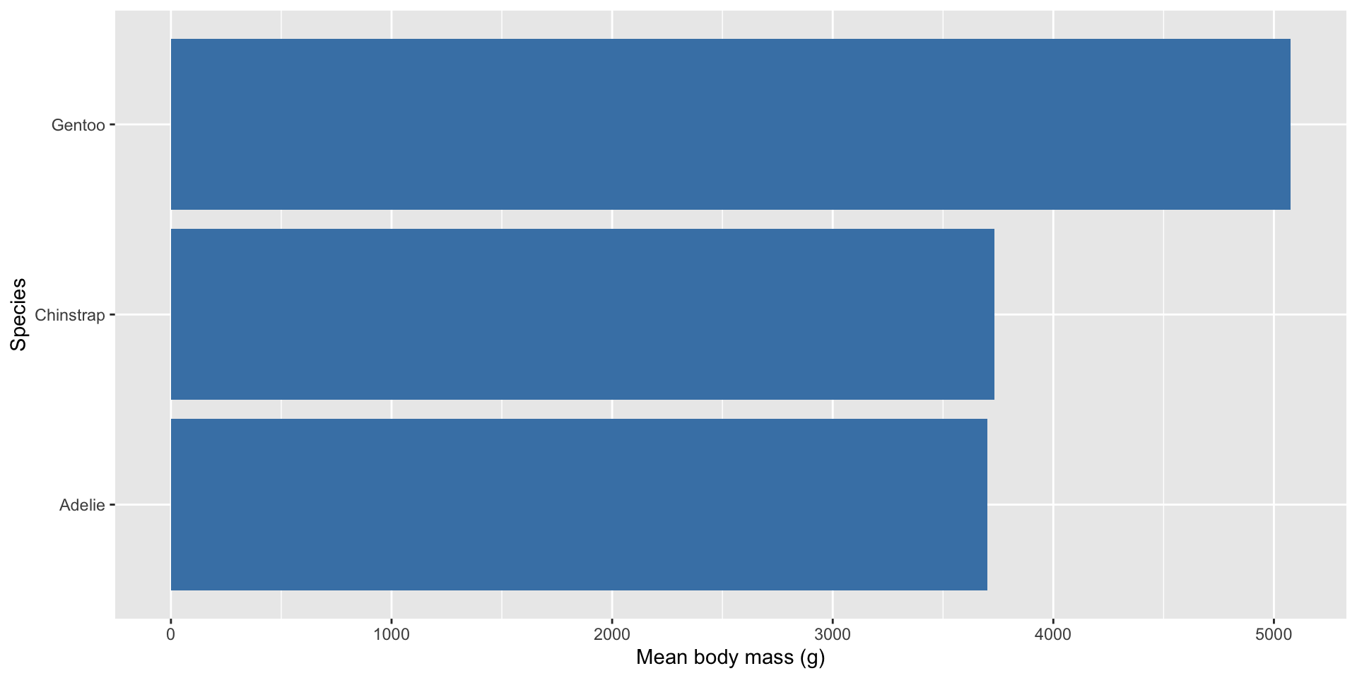
penguins |>
  filter(!is.na(body_mass_g)) |>
  group_by(species) |>
  summarise(mean_mass = mean(body_mass_g)) |>
  ggplot(aes(x = fct_reorder(species, mean_mass), y = mean_mass)) +
  geom_col(fill = "steelblue") +
  coord_flip() +
  labs(x = "Species", y = "Mean body mass (g)")

fct_reorder() (from forcats, part of tidyverse) sorts categories by a numeric value rather than alphabetically — this is one of the single biggest upgrades you can make to a bar chart’s readability.

A gentle note on the pipe |>

  • |> means “take the thing on the left, and feed it into the function on the right”
  • penguins |> filter(...) |> group_by(...) |> summarise(...) reads like a recipe, step by step
  • This is dplyr/tidyverse data wrangling — a natural next skill after visualisation (a great topic for a future SARA session!)

Saving Your Plots

ggsave() — from screen to file

my_plot <- ggplot(penguins, aes(x = flipper_length_mm, y = body_mass_g, color = species)) +
  geom_point(alpha = 0.7) +
  theme_minimal() +
  labs(title = "Flipper Length vs Body Mass", x = "Flipper length (mm)",
       y = "Body mass (g)", color = "Species")

ggsave("penguin_plot.png", plot = my_plot, width = 8, height = 5, dpi = 300)
  • Save the plot into an object first (my_plot <-), then pass it to ggsave()
  • dpi = 300 is the standard print-quality resolution for papers/posters
  • Common formats: .png (presentations/web), .pdf/.svg (papers, scalable, crisp for print)

Choosing width, height & format

Use case Format Tip
Slides / Word doc .png width/height in inches, dpi = 300
Journal submission .pdf or .tiff check journal’s exact size/DPI requirements
Poster .pdf or .svg scalable, won’t blur at large sizes
Website .png or .svg smaller file sizes matter
ggsave("penguin_plot.pdf", plot = my_plot, width = 8, height = 5)

Your Turn 4 (7 min)

  1. Build any polished plot of your choice from today
  2. Save it as my_first_plot.png, sized 7 x 5 inches, at 300 dpi
  3. Find the file in your Files pane or working folder — open it!

Answer

final_plot <- ggplot(penguins, aes(x = species, y = body_mass_g, fill = species)) +
  geom_boxplot(alpha = 0.7) +
  theme_minimal() +
  labs(title = "Body Mass by Species", x = "Species", y = "Body mass (g)")

ggsave("my_first_plot.png", plot = final_plot, width = 7, height = 5, dpi = 300)

Mini Project

Mini project (20 min)

Build one complete, polished plot from scratch, using anything from all three sessions. Your plot should include:

  1. A sensible geom for your question (point / bar / box / histogram…)
  2. At least one meaningful aesthetic mapping (color/fill/shape)
  3. A title, axis labels, and a caption crediting the data source
  4. A theme (theme_minimal(), theme_bw(), etc.)
  5. A deliberate colour choice (scale_*_brewer, scale_*_viridis, or manual)
  6. Saved to a file with ggsave()

Work in pairs if you like. We’ll ask 2–3 volunteers to share their plot and the one question it answers.

One example mini project

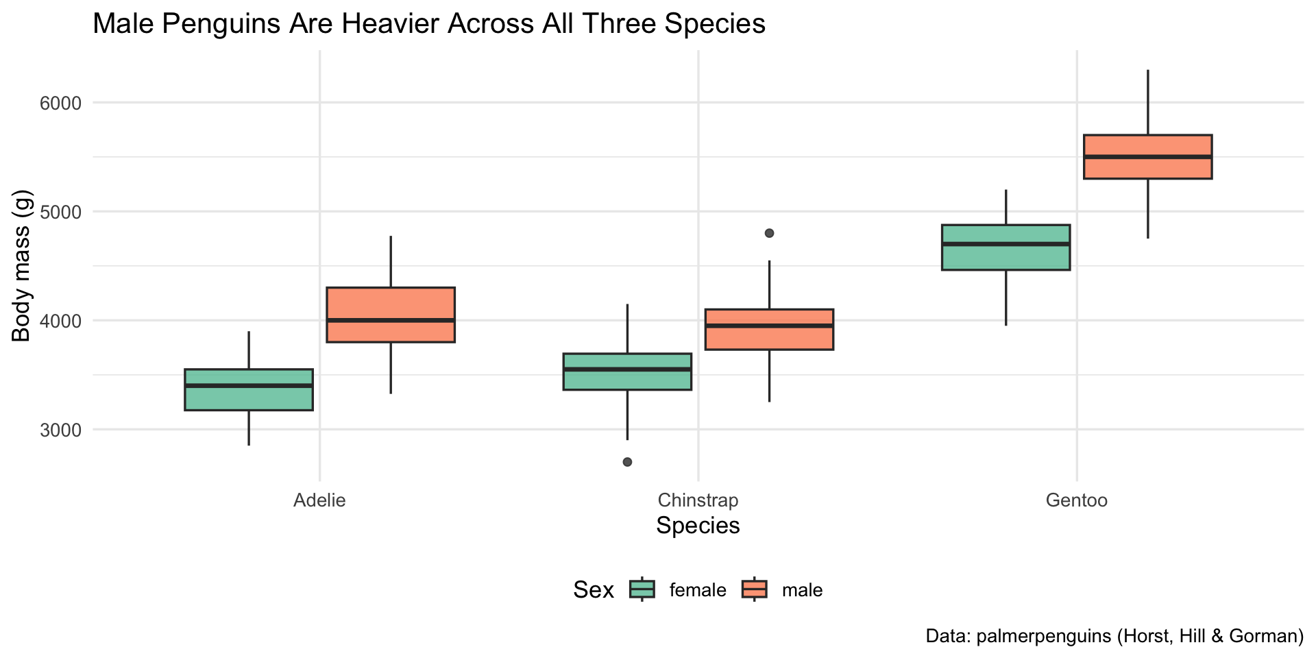
penguins |>
  filter(!is.na(sex)) |>
  ggplot(aes(x = species, y = body_mass_g, fill = sex)) +
  geom_boxplot(alpha = 0.8) +
  scale_fill_brewer(palette = "Set2") +
  theme_minimal(base_size = 13) +
  labs(
    title = "Male Penguins Are Heavier Across All Three Species",
    x = "Species", y = "Body mass (g)", fill = "Sex",
    caption = "Data: palmerpenguins (Horst, Hill & Gorman)"
  ) +
  theme(legend.position = "bottom")
Recap — all three sessions

  • Session 1: R & RStudio basics, <-, packages, ggplot(data, aes(x,y)) + geom_...()
  • Session 2: more aesthetics (size/shape/alpha), geom_smooth(), distributions (geom_histogram/geom_density), geom_boxplot(), facets
  • Session 3: labs(), themes, colour palettes, coord_flip(), fct_reorder(), ggsave()
  • You now hold the full grammar: data → aesthetics → geometry → facets → scales → theme → labels

Where to go next

  • Book: R for Data Science (Wickham, Çetinkaya-Rundel & Grolemund) — free online at r4ds.hadley.nz
  • Cheatsheet: RStudio’s ggplot2 cheatsheet (Help → Cheatsheets inside RStudio)
  • Practice: try these same techniques on your own research data
  • Community: R-Ladies, local R user groups, Stack Overflow’s [ggplot2] tag
  • Next at SARA: data wrangling with dplyr, and/or a Winter School of Statistics session

Thank you!

All three sessions complete 🎉

You came in having never written a line of R — you’re leaving with the ability to explore and publish your own data visualisations.

SARA Institute of Data Science — building open, first-generation, Ambedkarite research capacity, one dataset at a time.

Feedback / questions: please share with the SARA team — your input shapes the next Summer School!